Start with a small stretch of the colour wheel
An analogous palette uses colours that sit beside one another on the colour wheel. Blue, blue-green and green form one example; yellow, yellow-orange and orange form another. Because the hues share some visual qualities, they can make an outfit feel connected even when its pieces do not match exactly. Think of the wheel as a starting point, not a rule that requires every garment to be a pure, bright version of its colour.
Begin with one colour you already enjoy wearing. Then consider a neighbour on either side. If you own a forest-green shirt, you might try it with blue-green trousers or a blue scarf. You do not need all three hues at once: two can be enough to establish the relationship. This approach works especially well when you are trying to add colour to a wardrobe without making every piece compete for attention.
Give the colours different jobs
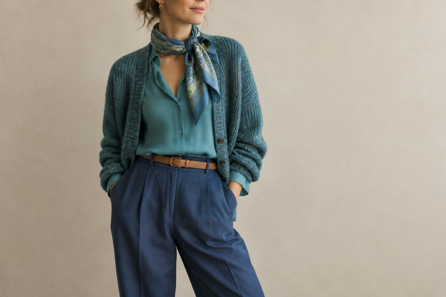
An outfit is often easier to read when one hue occupies most of the space and the others play supporting roles. Choose a main colour for a coat, dress or pair of trousers. Use a neighbouring hue for a second garment, then introduce a third through a smaller detail such as socks, a bag or jewellery. For example, blue trousers could anchor an outfit with a teal top and a small green accessory.
The balance is yours to adjust. A subtle version might pair a navy jacket with a muted blue-green knit, letting the relationship emerge gradually. A more expressive version could place an orange coat over a yellow-orange top. If the result feels too busy, reduce the area covered by one hue rather than removing colour altogether. Changing a bright shirt to a scarf can preserve the idea while making the outfit feel quieter.
Vary lightness and intensity
Colours can be neighbours yet still look awkward together if they have identical visual weight. Try varying how light, dark, vivid or muted each piece appears. A pale blue shirt can give a dark teal jacket breathing room; a soft olive accessory can settle an otherwise vivid green outfit. These differences help the eye distinguish individual pieces while keeping the palette cohesive.
You can also use familiar neutrals without abandoning the analogous idea. Cream may soften a group of warm hues, while charcoal can give deeper blues and greens a steady base. Choose the neutral for the effect you want rather than assuming it will disappear: a large white shirt, for instance, can become the brightest element in the outfit. Looking at the clothes together in ordinary daylight can help you judge their relationship more reliably than their colour names on a label.
Let texture and pattern add interest
When colours are closely related, texture can keep an outfit from feeling flat. Smooth cotton beside ribbed knitwear, or denim beside a glossy accessory, introduces variation without requiring another hue. The difference is most useful when two pieces are similar in colour: a matte green shirt and a textured green-blue jacket can remain distinct even from a distance.
Pattern offers another way to connect neighbouring hues. A striped scarf containing blue and green can bridge a blue coat and green bag. Start with one patterned item and pull one or two colours from it for the rest of the outfit. The colours do not have to match precisely. If a print already contains several strong tones, keeping the surrounding garments simpler will give it room to be noticed.
Test the palette against your intention
Before settling on an outfit, ask what you want it to communicate. Soft changes between neighbouring hues can feel calm and continuous; brighter combinations can feel playful or energetic. Neither effect belongs permanently to a particular colour family. Proportion, fabric and how you carry the look all contribute to the impression.
For a quick exercise, lay out three items in adjacent hues and take a photo. Make one item dominant, then swap which item carries the strongest colour. Notice whether your eye goes first to your face, a garment or an accessory, and decide if that emphasis suits your intention. Keep the combination that feels like you, even if it uses only two hues. An analogous palette is most useful when it helps you make deliberate choices, not when it limits them.