A colour is also a surface
Picture a blue cotton shirt beside a blue satin scarf. Even if their colours look close when laid flat, they may play different roles in an outfit. The shirt might appear steady and understated; the scarf might catch the eye each time it moves. Colour gives you a starting point, but fabric determines how that colour meets the light.
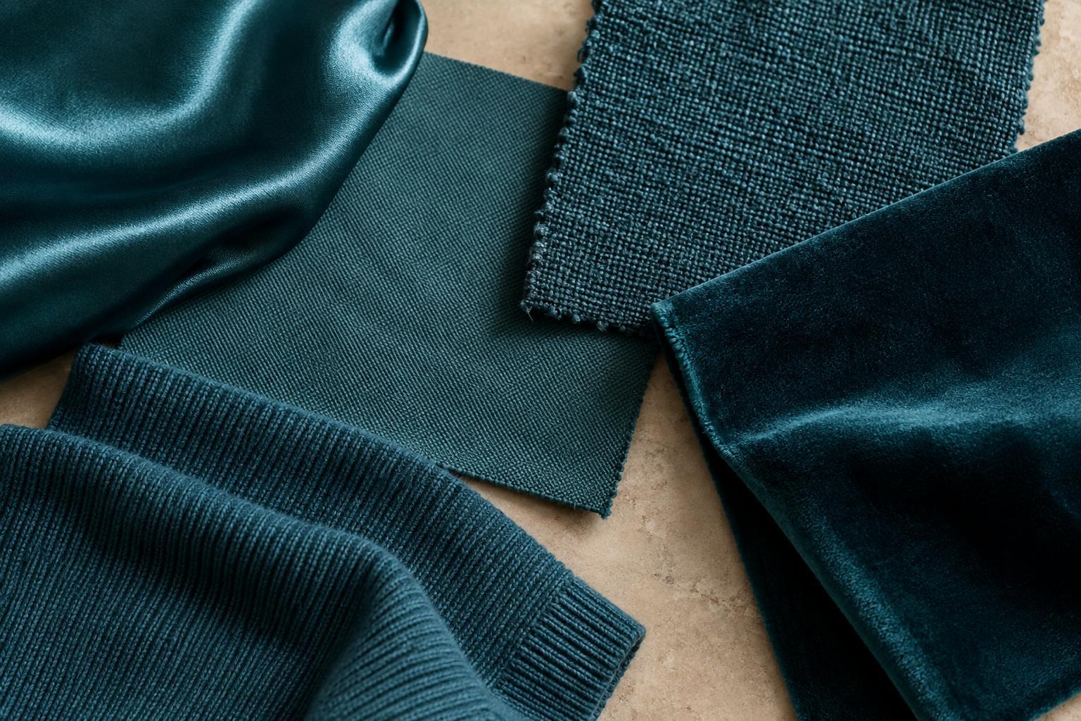
Texture describes the surface you can see or feel, such as a smooth weave, raised rib, fuzzy nap or open knit. Finish describes qualities such as matte, glossy or softly lustrous. These features can make a colour seem deeper, brighter, softer or more varied. Paying attention to them gives you another way to express yourself without changing your whole palette.
How smooth, shiny and matte surfaces behave
A smooth, glossy fabric reflects light in noticeable highlights. As the fabric folds, bright and dark areas can sit close together, making even a quiet colour feel animated. A red satin accessory, for example, may draw more attention than a red matte accessory of similar size. Shine can be useful when you want one detail to serve as a focal point.
Matte fabrics tend to show fewer sharp highlights. A matte navy jacket may therefore read as a more continuous block of colour than a lustrous navy one. Neither effect is inherently formal or casual; the garment’s shape and the rest of the outfit matter too. Ask what you want the colour to do: hold the look together, or change visibly as you move?
Texture can soften or break up colour
Raised or fuzzy surfaces interrupt the appearance of a flat, solid colour. On a brushed fabric, fibres catch light from different angles and soften the edges of folds. A bright shade may feel less crisp on a fuzzy knit than it does on a smooth, tightly woven fabric. Corduroy, ribbing and chunky knits create their own small areas of shadow, giving a single colour visible variation.
This matters when combining pieces that seem to match. Two greens can look different not only because their dyes differ, but because one surface reflects light evenly and the other is full of ridges or loose fibres. Instead of forcing an exact match, try treating them as a deliberate pair. A smooth green trouser and a textured green sweater can look cohesive because they share a colour family while offering different surfaces.
Use finish to adjust contrast and emphasis
Texture can change the balance of an outfit as much as colour contrast does. A glossy black belt against matte black clothing may stand out through its finish, even though the colours are nearly identical. Conversely, a matte accessory can quiet a vivid colour by removing the sharp highlights that might otherwise compete with the rest of the look.
Try choosing one area for surface contrast. If your outfit includes a patterned, textured jacket, a smooth bag may give the eye a place to rest. If your clothes are mostly smooth and matte, a softly lustrous scarf or ribbed sock can add interest without introducing another print. This is especially helpful when you enjoy a limited colour palette but want it to feel expressive rather than uniform.
A simple exercise for seeing the difference
Gather three items in the same colour family but with different surfaces: perhaps a cotton T-shirt, a knitted sweater and a glossy accessory. Place them together in indirect daylight, then look again under the lighting where you usually wear them. Notice which item appears lightest or darkest, which shows the strongest highlights and which catches your attention first. Turn each item or let it drape to see whether the effect changes.
Next, build an outfit around two of the items. If the combination feels busy, reduce contrast elsewhere by choosing simpler shapes or fewer accessories. If it feels flat, add a surface that behaves differently in the light. You do not need to memorize rules about which fabric belongs with which colour. The useful habit is to compare garments as they will be worn, then decide whether their surfaces support the impression you want to make.