Start with the job you want the colour to do
An accent colour is a colour you use to draw attention within an outfit. It might appear in a scarf, a pair of shoes, a print or even a visible stitch. There is no fixed amount you need. The useful question is: what should someone notice first? A small accent can give the eye a destination, while a larger area of colour can shape the whole impression.
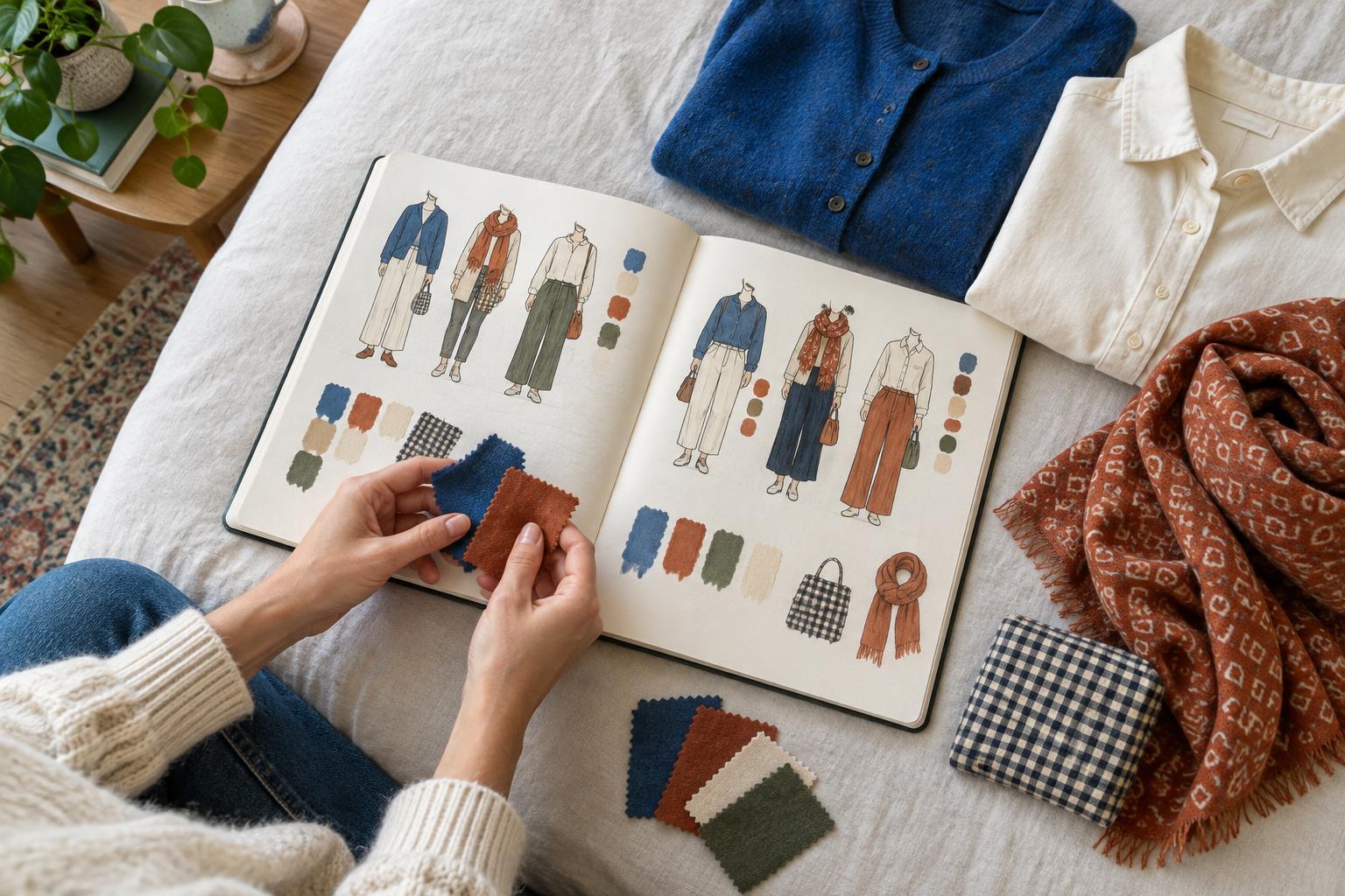
Before adding anything, name the effect you want. Perhaps you want a quiet outfit with one playful detail, or you want a familiar combination to feel more energetic. Try describing the outfit in a few words, such as “calm with a flash of orange” or “mostly blue with a bright green rhythm.” That description gives you a way to judge each addition: does it reinforce the idea, or compete with it?
Think in areas, not strict percentages
The apparent amount of accent colour depends on more than how much fabric it covers. A narrow red belt against a pale outfit may stand out more than a large rust-coloured bag beside dark brown clothing. Brightness, contrast, texture and position all affect how strongly a colour reads. Treat proportion as something you observe, not a rule you have to calculate.
For a subtle accent, begin with one contained area: earrings, socks, a small bag or a patterned collar. For a stronger effect, move the colour to a more visible garment or use it in two or three places. Look at the full outfit from a few steps away. If the accent disappears, increase its size or contrast. If it pulls your attention away from everything else and that was not your aim, reduce it or choose a softer shade.
Use placement to guide the eye
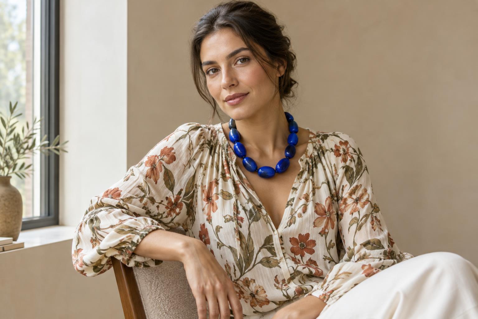
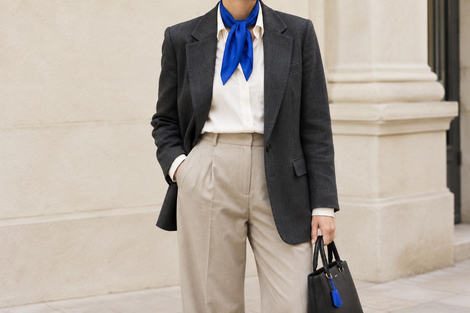
Where the colour sits can matter as much as how much you use. An accent near the face tends to bring attention upward; one at the feet can make the outfit feel grounded or give a simple silhouette a surprising finish. A colourful bag at the side can interrupt a long stretch of neutral clothing. Try moving the same accent between these positions before deciding that you need more of it.
Repetition is another option, but it does not have to mean an exact match. A green hair clip and a print containing a little green can feel connected without looking like a set. You can also repeat the character of a colour rather than its precise shade: for example, two warm reds may relate to each other even if one is deeper. If every detail matches too neatly for your taste, let one accent stand alone.
Let pattern count as colour
A patterned piece may already contain the accent an outfit needs. Look for the colour that catches your eye first, then decide whether to echo it elsewhere. Pulling out a less obvious colour from the pattern can create a quieter connection. Either approach can work; the point is to notice what the print is doing before adding another bright item.
Scale also changes the result. A densely patterned shirt may make several colours visible at once, even if each appears only in small marks. A coat with one broad coloured stripe can create a much simpler focal point. When an outfit feels busy, try removing an accent before replacing the pattern. When it feels flat, a small item that picks up one colour in the print may be enough.
Run a quick three-version test
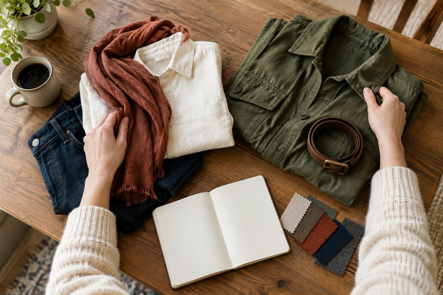
Choose an outfit you already wear and make three versions. First, wear it without an added accent. Next, add one small coloured item. Finally, add a larger area of the same colour or repeat it in another place. Take a photo of each version in similar light, or look at each one from the same distance in a mirror. Which version communicates the feeling you named at the start?
Notice what happens when you move, too. A scarf may be prominent while you are standing still but less visible under a coat; a bag may become the strongest colour when carried. You do not have to select the most balanced-looking version. Choose the one that feels useful and comfortable for the setting. Accent colour is a tool for emphasis, and you get to decide what deserves it.