Give the print a clear role
A printed piece already contains several visual decisions: colour, shape, scale and rhythm. Solid colours can support those decisions rather than compete with them. Before getting dressed, decide what you want the print to do. A patterned coat might be the main event; a printed scarf might be a small point of interest near your face. This choice helps you decide how much of the outfit should remain quiet.
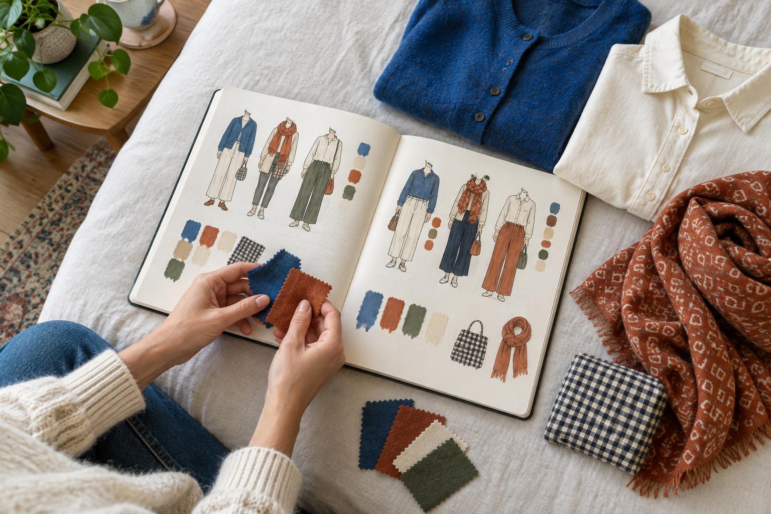
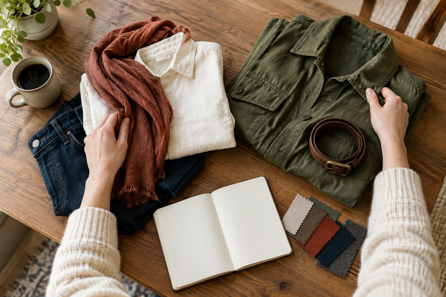
Start with one printed item and build around it. Lay it beside the solid pieces you are considering, then step back and look at the whole arrangement. If your eye moves easily to the print and then around the outfit, the balance is probably working. If every piece asks for equal attention, try changing one item to a calmer colour or simpler shape. Balance does not mean hiding the print. It means giving it enough space to be seen.
Pick solid colours from inside the pattern
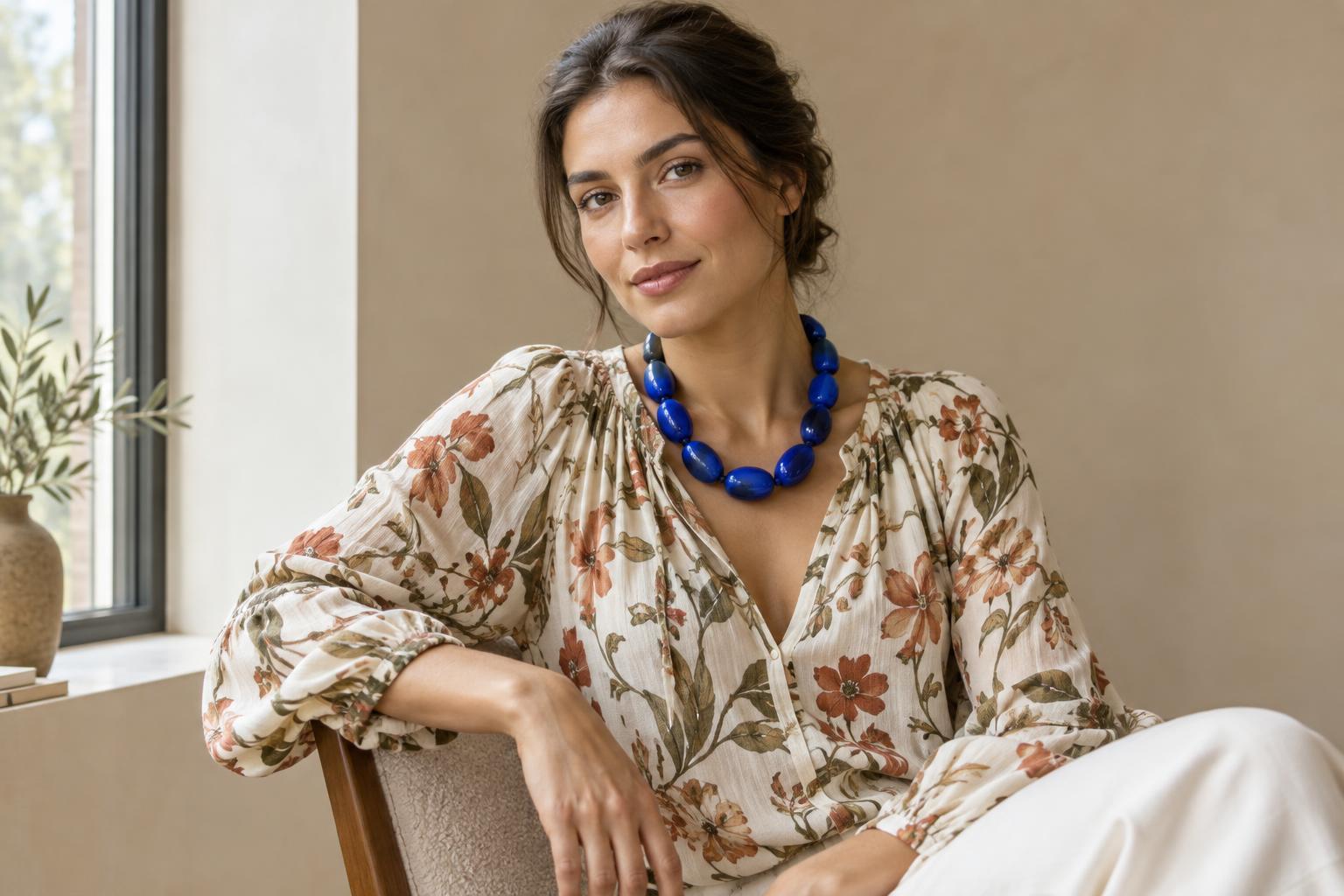
One reliable approach is to repeat a colour that already appears in the print. A floral shirt with small touches of rust, for example, can connect naturally to solid rust trousers or a bag. The repeated colour makes the outfit feel related without requiring every item to match exactly. You can choose the print’s most prominent colour for a coordinated look, or pick a less noticeable colour to bring out a detail that might otherwise be missed.
The solid does not have to be a perfect match. Colours can vary in depth and still feel connected: a pale blue detail in a print may sit comfortably with deeper blue denim. If you are unsure, place the pieces next to each other in natural light and ask whether they share a similar warmth or coolness. Alternatively, use a solid colour that is not in the pattern but works with its overall mood. This can create a more expressive outfit, especially when the print itself has a limited palette.
Adjust contrast to suit the effect you want
Contrast changes how strongly a print stands out. A black-and-white patterned skirt with a black top creates a clear, graphic relationship. The same skirt with a soft grey top may feel gentler. Neither is inherently more balanced; they simply produce different effects. Consider contrast in both colour and lightness. A bright solid beside a bright print can feel energetic, while a muted solid often lets the print take the lead.
Neutrals are useful, but they are not the only way to calm an outfit. Navy, olive, burgundy and other quieter colours can function as visual anchors when they have less intensity than the print. If a combination feels too busy, you do not necessarily need to remove colour. You might instead choose a darker or more muted version of it. The aim is to control where the strongest contrast appears, not to follow a rule that prints must always be paired with beige, black or white.
Consider proportion and placement
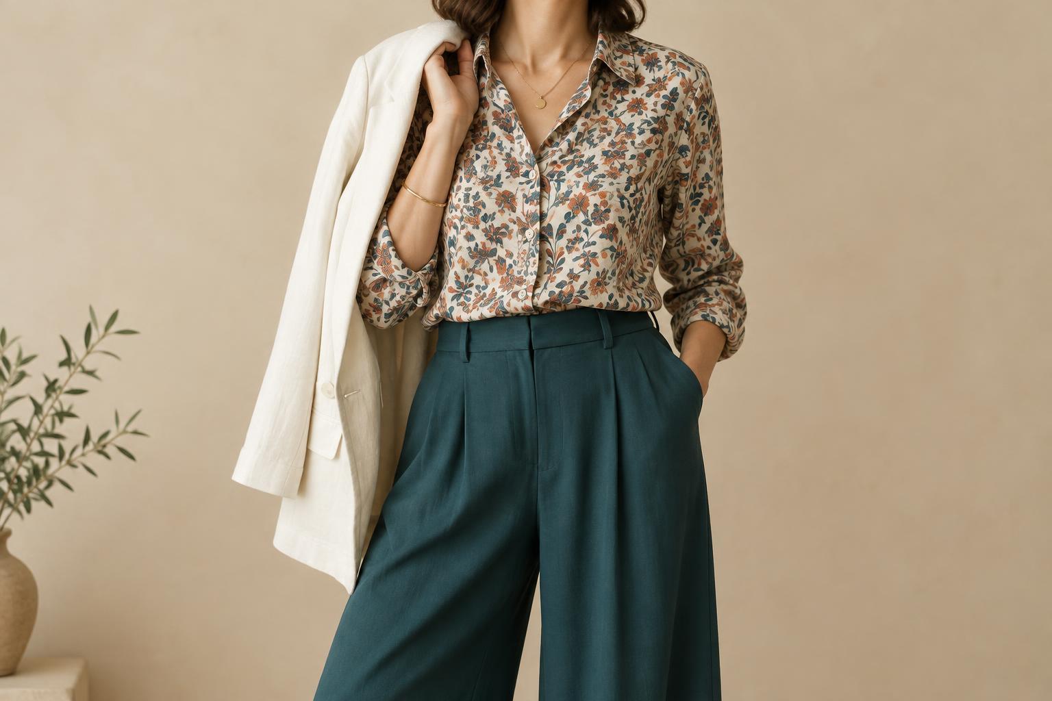
How much of each piece is visible matters as much as its colour. A fully printed dress under a solid jacket reads differently from the same dress worn on its own. The jacket breaks up the pattern and creates a broad area of rest. Likewise, a printed shirt tucked into high-waisted solid trousers may show less pattern than an untucked shirt. Small changes in layering can make familiar clothes feel more or less expressive without buying anything new.
Think about where you want attention to go. A printed scarf draws the eye upward; patterned shoes bring interest to the lower half of an outfit. A solid item placed next to a print acts like a frame, especially if its shape is simple. Texture also plays a part: a chunky knit or shiny fabric can attract attention even when it is one colour. If the outfit feels crowded, try a smoother solid fabric or an accessory with fewer visible details.
Test combinations before making rules
Try a short exercise with one printed piece and three solid alternatives: one colour taken directly from the print, one quiet neutral and one colour you would not usually pair with it. Put on each combination and notice what changes. Which version makes the print stand out? Which feels most like you? Looking at the full outfit in a mirror, rather than judging two fabrics side by side, helps you see the effect of proportion and placement.
You can also change just one element at a time: swap the top, add a solid layer or move the printed item from a large garment to a small accessory. This makes it easier to identify why a combination works for you. The most useful balance is not a fixed ratio of print to solid. It is an outfit in which the pattern has a purpose, the solid colours support it and the overall effect reflects how you want to express yourself.