Decide what the viewer should notice first
Before choosing a wall, room or outdoor setting, identify the point of the image. Is it the shape of a coat, the colour pairing in an outfit, or a small accessory? A useful background makes that detail easier to see. It can add mood and context, but it does not need to be interesting on its own.
Try describing the image you want in one sentence: “The red scarf should draw the eye against a quiet setting,” or “The layered silhouette should feel at home in the city.” Then look at possible locations through that lens. If a background has a sign, bright object or strong pattern that attracts attention before the outfit does, adjust the frame, move a few steps or choose another spot.
Use colour to create separation
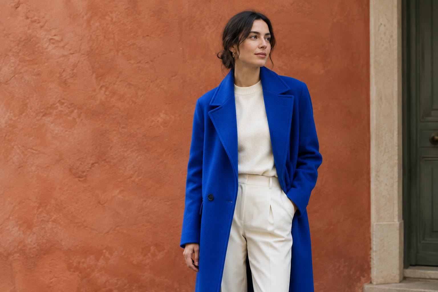
Clothing needs enough visual separation from its surroundings for its shape and details to register. A black outfit against a dark wall may create a deliberate, moody image, but it can also hide the cut of a sleeve or trouser leg. A lighter or differently coloured background often makes those edges clearer. The goal is not always maximum contrast; it is enough contrast for the feature you want to show.
Look beyond whether colours match. A green jacket against foliage may blend into the scene, while the same jacket against a warm brick wall may stand out. If the outfit contains several colours, a background that echoes one quieter colour can bring the image together without competing with its strongest element. Take a quick test photo and view it at thumbnail size. If you cannot immediately tell where the outfit ends and the setting begins, try another angle or surface.
Match texture to the message
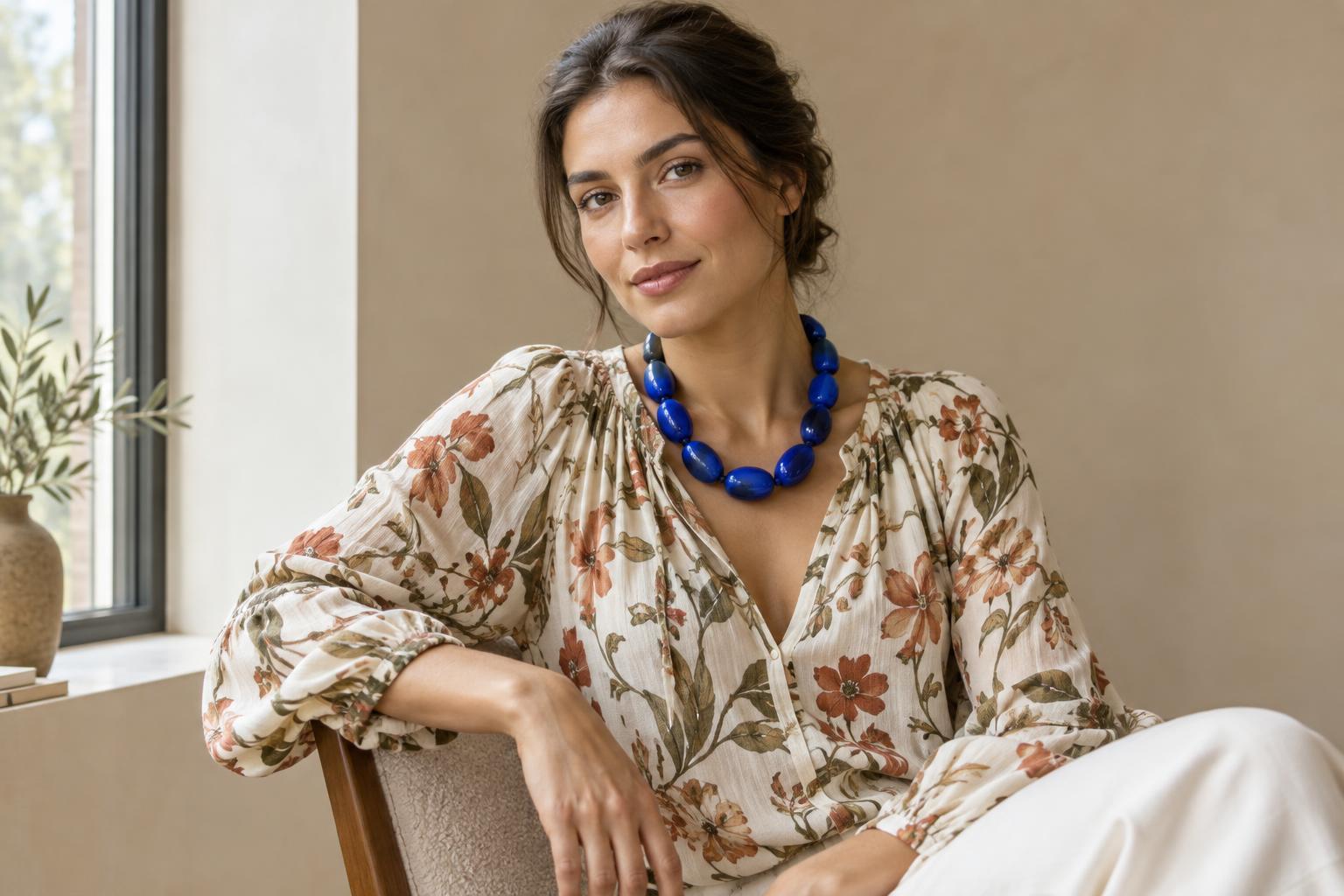
Background texture can reinforce the character of clothing. A smooth wall can give embroidered fabric, pleats or layered jewellery room to be noticed. Weathered wood or stone can lend a more tactile feel to a simple outfit. Neither choice is inherently better; what matters is whether the textures work together. When both the outfit and the setting have intricate patterns, the eye may struggle to find a resting place.
Pay attention to lines and shapes as well. A doorway can frame a full-length silhouette, while a plain stretch of pavement can leave space around wide trousers or a flowing hem. Watch for lines that appear to cut across the body or objects that seem to grow out of a shoulder in the photograph. Small changes in where the person stands can make a busy location feel much calmer.
Check the light before committing to the location
An attractive background is less useful if its light obscures the clothing. Strong shadows can hide texture, and uneven patches of light can make one part of an outfit much brighter than another. Turn toward the light, move into even shade or change the time or position of the shot if those options are available. Notice whether the background is much brighter than the person, too: a bright window behind a dark outfit may make its details difficult to see.
You do not need elaborate equipment to assess a setting. Take one photo, then check the areas that matter: Can you see the fabric, colour and outline? Does the face or a reflective surface pull attention away from the detail you meant to feature? What looks balanced in person can look different through a camera, so let the test image guide the final choice.
Let context contribute, then simplify the frame
A background can tell viewers something about the person wearing the clothes. A studio corner might suggest a creative routine; a garden path might give a relaxed outfit a sense of movement. Choose context because it adds meaning, not simply because it is available. If the setting is important to the story, show enough of it to be recognizable. If the clothes are the story, move closer or leave more uncluttered space around them.
For a practical exercise, photograph the same outfit against three backgrounds: one plain, one textured and one that suggests an activity or place. Keep the pose and framing as similar as you can. Compare where your eye goes first, which clothing details remain visible and what each image seems to say. The strongest choice is not necessarily the most striking location. It is the one that helps the outfit communicate what you intended.