Start with the effect you want
Contrast is the difference between elements you wear. A white shirt against black trousers creates an obvious division; a cream shirt with oatmeal trousers creates a softer transition. Neither is automatically more flattering or more stylish. The useful question is what you want your outfit to communicate. Do you prefer a calm, continuous shape, a clear focal point, or a bold arrangement of separate pieces?
Think of outfit contrast as a dial rather than a rule. At the low end, similar colours and lightness levels blend together. In the middle, differences are visible without dominating. At the high end, light and dark pieces, vivid colour pairings or strong patterns catch the eye quickly. You can turn that dial up or down from one outfit to the next without changing your overall sense of style.
If you are unsure where to begin, choose three words for your preferred look, such as relaxed, precise and playful. Then ask which kinds of contrast support those words. A precise look might use a sharp light-dark boundary; a relaxed one might use gentle colour shifts. Playfulness could come from a single unexpected accent rather than contrast across the whole outfit.
Notice the different kinds of contrast
Lightness contrast is often the easiest to spot. Put two garments side by side and imagine them in black and white: would one look much lighter than the other? A charcoal jacket over a pale shirt has strong lightness contrast, even if both colours are muted. A dark navy jacket over dark brown trousers has less, despite the difference in hue.
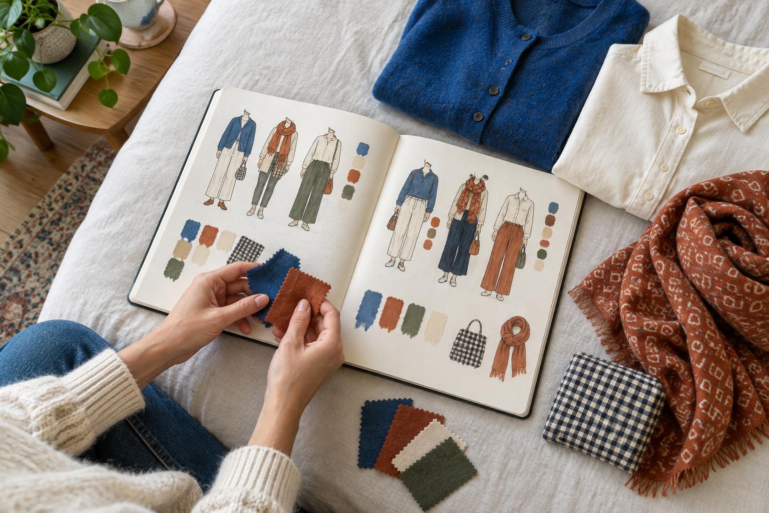
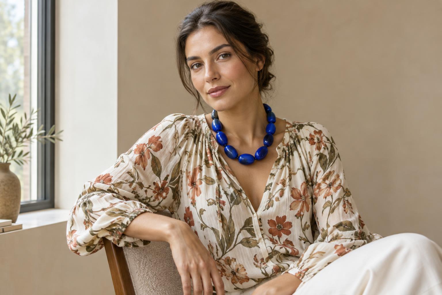
Hue contrast comes from the colours themselves. Blue and orange may appear more distinct than two nearby shades of blue. Saturation adds another dimension: a vivid green bag will stand out against dusty green clothing, even when the colours belong to the same family. Texture and pattern matter too. A smooth shirt beside a chunky knit, or a small print beside a solid fabric, can create visual interest without a dramatic colour change.
These differences can work together or balance one another. A bright colour in a tiny area may feel subtler than a large pale panel against a dark outfit. When an outfit feels busier than you intended, you do not necessarily need to remove colour. Try reducing the size of the contrasting area, softening its lightness difference or keeping the surrounding pieces more consistent.
Build low, medium and high contrast deliberately
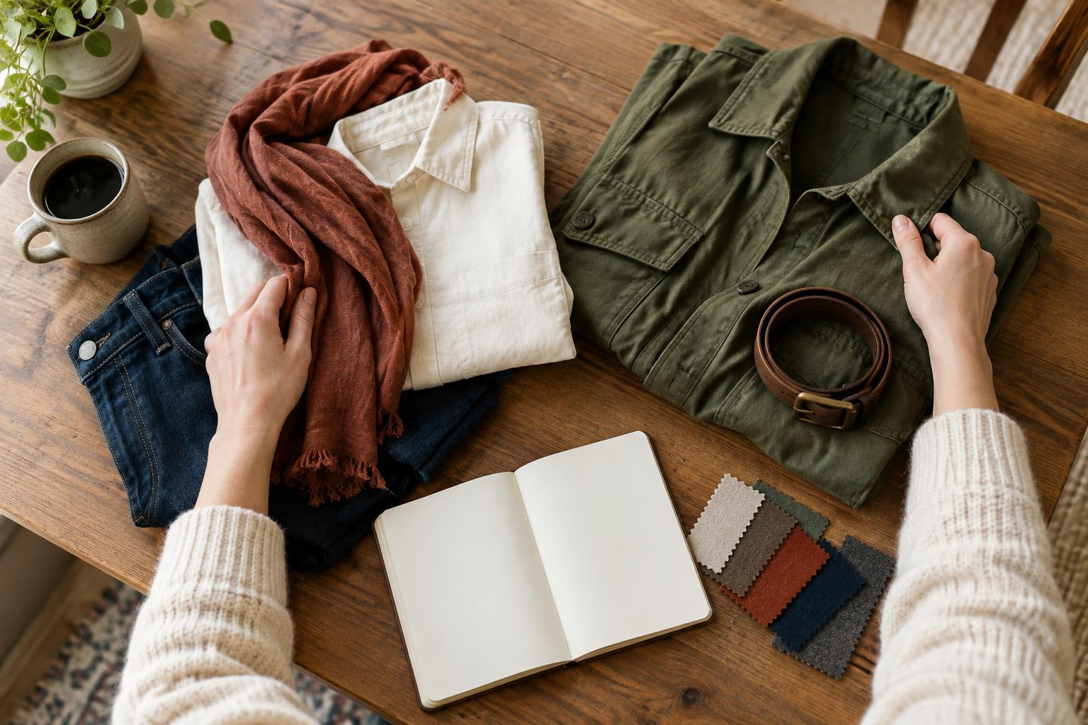
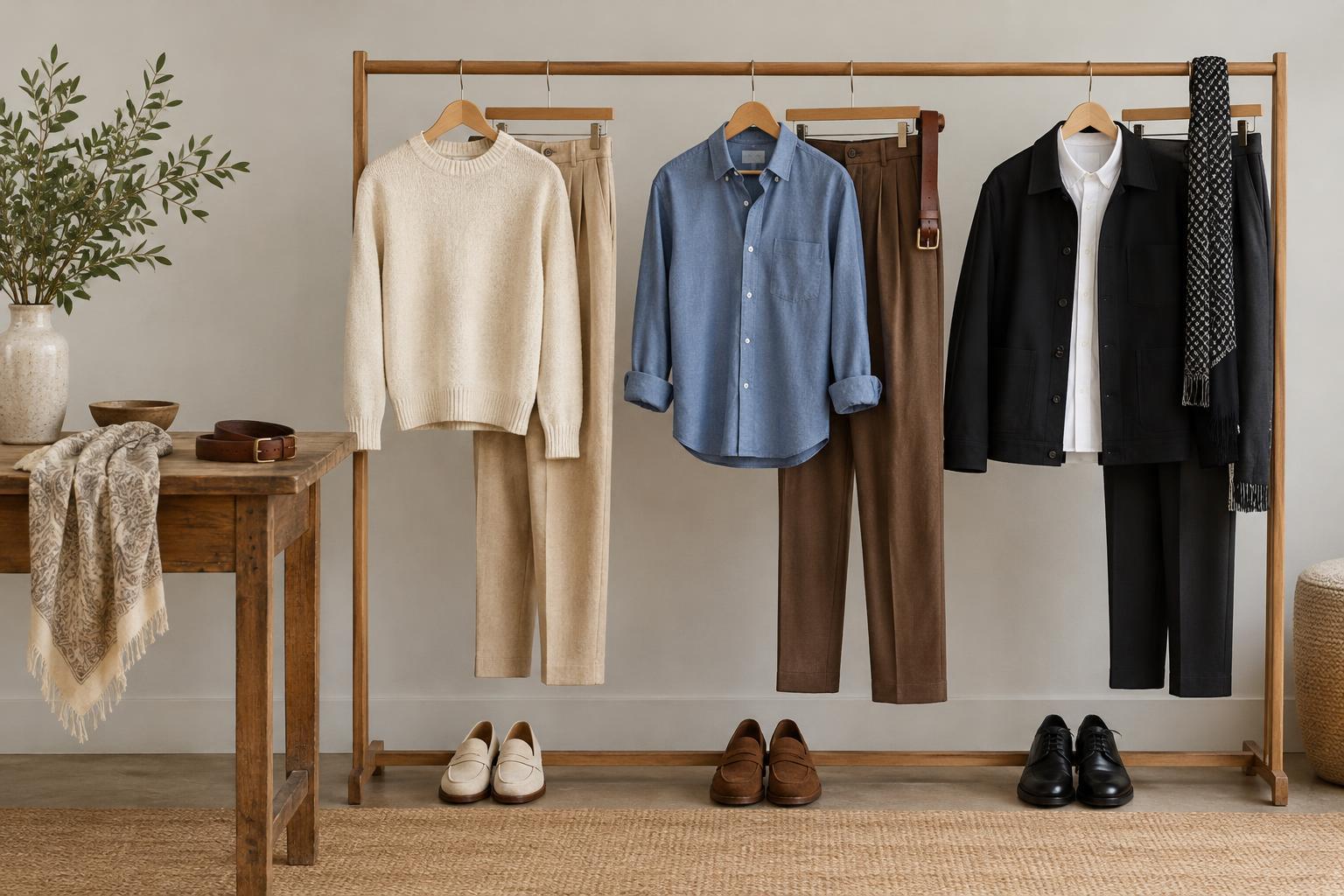
For a low-contrast outfit, start with pieces that sit close together in lightness: cream with light beige, or deep blue with charcoal. They need not match exactly. Small shifts in shade and texture keep the outfit from looking flat while preserving a continuous silhouette. If you want a finishing detail, repeat a colour already present in a shoe, belt or accessory.
For medium contrast, keep most of the outfit cohesive and introduce one noticeable difference. Mid-blue denim with a white tee and a navy layer is an approachable example: the white is distinct, while the blues connect the pieces. You could also pair similar lightness levels in different colours, then add a darker bag or shoe to anchor the look.
For high contrast, let the separation be intentional. A light top with dark trousers creates a strong horizontal boundary; a dark outfit with a bright scarf draws attention upward. Decide where you want the eye to land before adding several competing accents. Repeating one high-contrast colour in two small places can make a bold choice feel connected rather than accidental.
Use placement to guide attention
The location of contrast changes its effect. A contrasting collar or pair of earrings brings detail near the face. Contrasting shoes place emphasis at the bottom of an outfit. A belt in a noticeably different colour marks the waist, while a jacket that differs sharply from the clothing beneath it creates a clear outer frame. None of these placements is universally best; they give you different ways to direct attention.
Pattern offers another way to choose a focal point. If you want a patterned shirt to lead, pair it with quieter pieces that pick up one of its colours. If you prefer the pattern to sit in the background, choose a smaller-scale print or reduce the difference between its colours. When combining prints, vary their scale and give them a shared colour so they have something in common.
Accessories are useful when you want to experiment without rebuilding an outfit. Try the same clothes with a matching bag, then with a contrasting one. Change only the shoes or scarf and notice whether the outfit feels calmer, sharper or more expressive. A small item can have a strong effect when its colour is unlike everything around it.
Test your preference with clothes you already own
Choose one outfit you enjoy wearing and make three versions. For the first, keep the colours and lightness levels close. For the second, add one distinct element. For the third, create a stronger difference with a light-dark pairing, vivid accent or prominent pattern. Photograph each version in similar light, standing at the same distance from the camera. Looking at the full outfit makes it easier to judge its overall effect than studying individual pieces on a hanger.
Ask yourself where your eye goes first, whether that is where you want it to go, and which version feels most like you. You may find that you like quiet clothing with bold accessories, or strong colour differences with simple shapes. Keep those observations as preferences, not restrictions. The aim is to make contrast a choice you can repeat or change whenever your mood, setting or creative intention calls for it.