Start with a colour, not a pattern
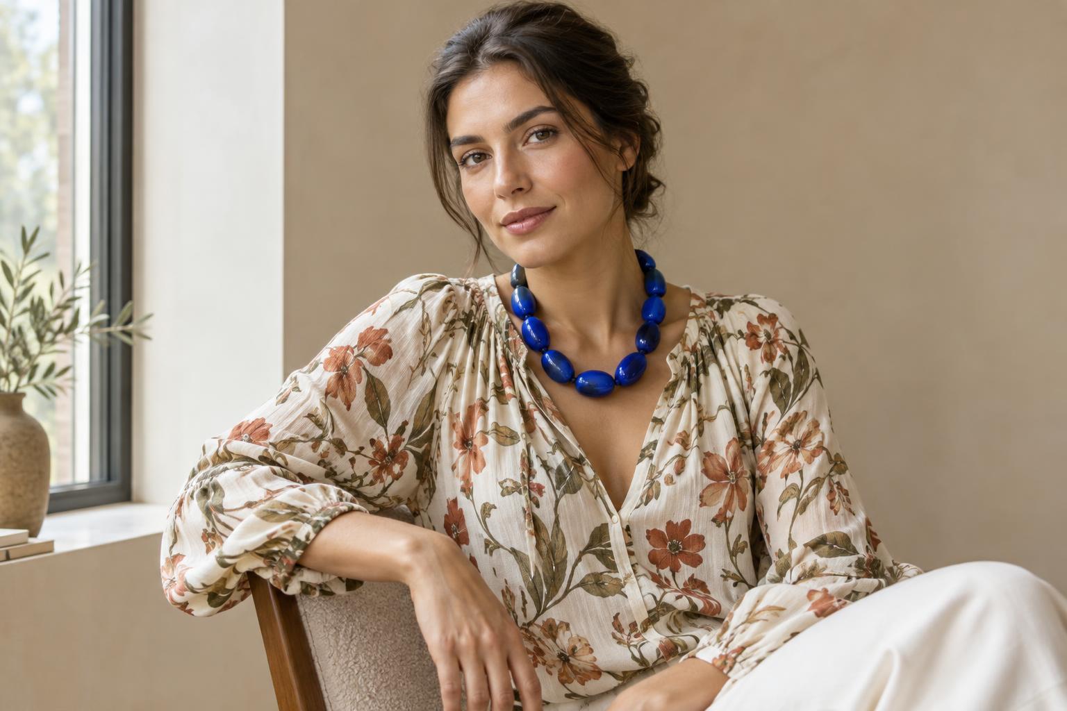
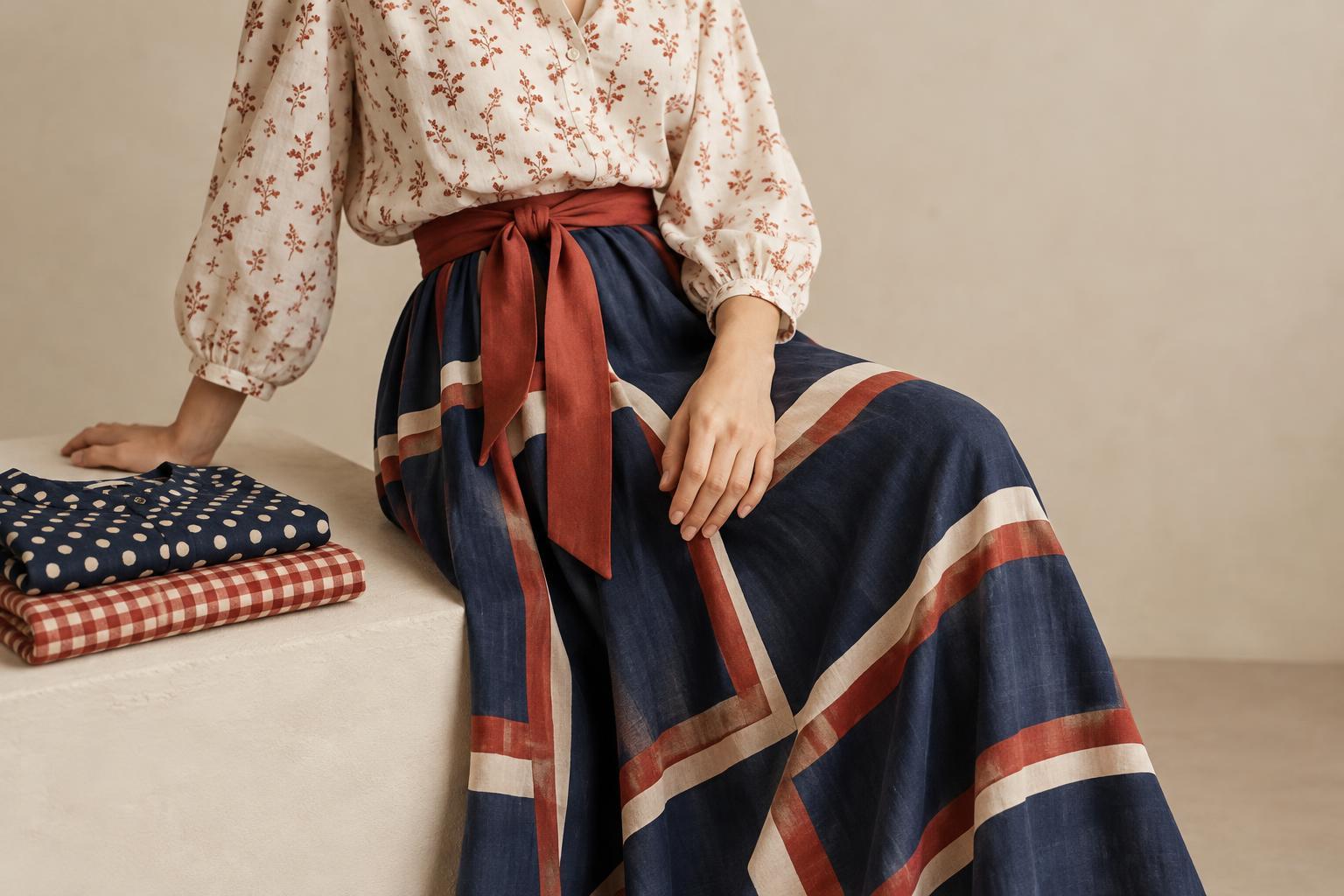
Two prints do not have to match to look good together. A shared colour gives the eye a connection between them, even when their shapes are different. A navy striped shirt and a floral scarf with a little navy, for example, can feel related without looking coordinated from head to toe. The common shade acts as an anchor; the other colours and shapes give the outfit its character.
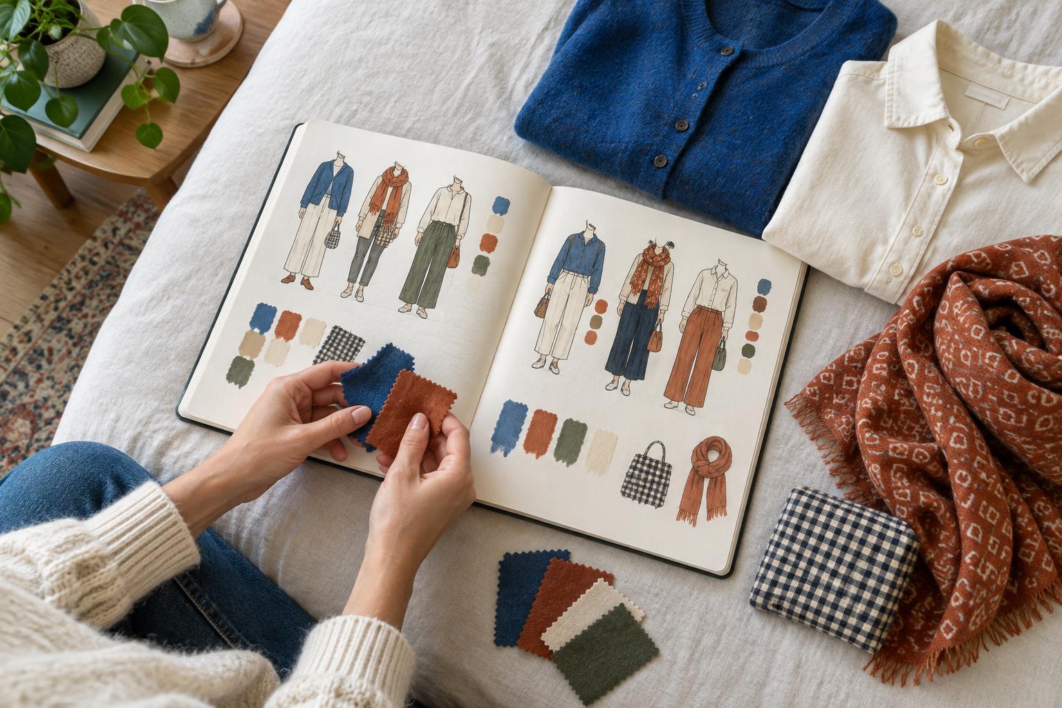
Begin with a printed piece you want to wear. Identify one colour in it that you can see without searching too hard, then look for a second print that contains that shade. The colour need not occupy the same amount of space in both pieces. It might be the background of one print and a small detail in the other. What matters is that you can notice the connection when you see the pieces together.
Let the prints play different roles
A shared colour provides a starting point, but the size of each pattern also affects how the combination reads. Try pairing a larger, more open print with a smaller, denser one. Broad checks beside fine dots, or a large botanical motif beside narrow stripes, give the eye two distinct things to follow. If both prints are equally busy, the result may feel more energetic than you intended.
You can also decide which print should lead. A patterned coat might take up most of the visual space, while a printed scarf adds a smaller echo of its colour. For a quieter version, reverse the balance: wear a subtle printed garment and introduce a bolder pattern through a bag or pair of socks. Neither approach is more correct. The useful question is where you want someone’s eye to go first.
Check how the colours behave together
A colour can change character depending on what surrounds it. A bright red detail may stand out sharply against white but blend into a print full of deep, warm colours. When you bring two patterned pieces together, look beyond the shared shade. Notice whether their overall palettes feel bright or muted, warm or cool, light or dark. They do not need to agree on every point, but these differences help explain why one pairing feels calm and another feels lively.
If the combination feels disconnected, try adding a plain item in the shared colour. A solid belt, top or pair of shoes can repeat the shade and make the link easier to see. Alternatively, remove a third competing colour by swapping one garment for a neutral. This is not a requirement to make the outfit simpler; it is a way to find out which part of the combination is bothering you.
Use space to make the pairing readable
Prints can sit directly beside each other, but they do not have to. A plain layer between them creates a pause. Picture a patterned shirt under a solid jacket, with a different print on a scarf or bag. The common colour still connects the prints, while the jacket gives each one room to be noticed. This can be a comfortable first step if wearing two large patterned garments feels like too much.
Pay attention to where the prints appear on your body, too. A printed top and patterned trousers create a larger, continuous statement; a patterned skirt and small printed accessory create a more dispersed one. Try both arrangements before deciding that a pair of prints does not work. Sometimes changing their placement, rather than changing the pieces themselves, makes the outfit feel more like you.
Try a quick exercise with your wardrobe
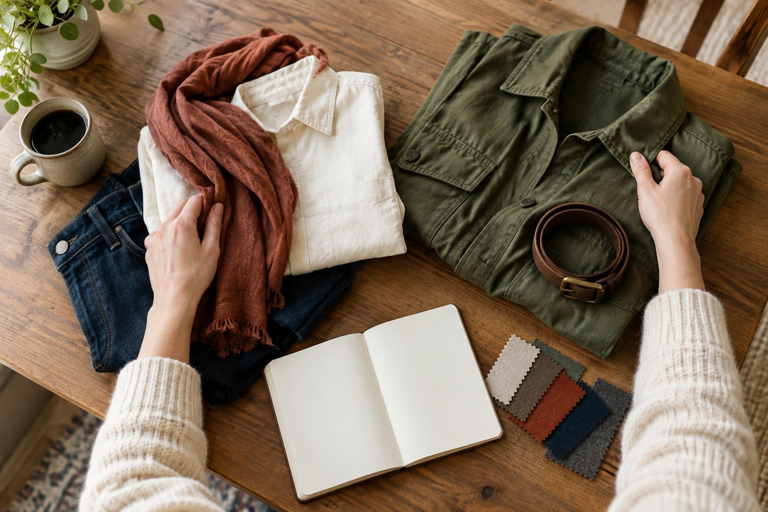
Choose one printed item and lay it where you can see its full pattern. Pick a colour from it, then find two other printed items containing that shade. Place each candidate beside the first item and ask three questions: Can I spot the shared colour? Do the patterns have different enough scales or shapes to read separately? Which piece feels like the focus? There is no need to find a perfect answer; the comparison helps you see what you prefer.
Try on your favourite pairing and view it from a few steps away. If you like it close up but not at a distance, experiment with a plain layer or a smaller dose of one print. If it feels too restrained, let more of the second pattern show. Taking a photo can help you compare versions without relying on memory. Keep the combination that communicates what you want, whether that is playful, composed or somewhere between.