Start with what the print is doing
A print already gives the eye something to follow, but that does not mean every accessory has to be quiet. Before adding one, look at the print from a few steps away. Does it read as a soft field of colour, or can you pick out individual shapes? A small, closely spaced motif may appear subtle at a distance, while large, high-contrast shapes can command attention across the room.
Notice where the pattern sits. A printed shirt places detail near your face and shoulders, so earrings or a necklace will interact with it directly. Printed trousers leave more visual space around a necklace, scarf or pair of glasses. You are not looking for a rule about which item is allowed to stand out. You are deciding where you want someone’s eye to land first.
If you are unsure, put on the printed garment before choosing an accessory. Seeing the print on your body, rather than folded on a chair, makes it easier to judge its scale and the empty spaces around it.
Choose a relationship, not a perfect match
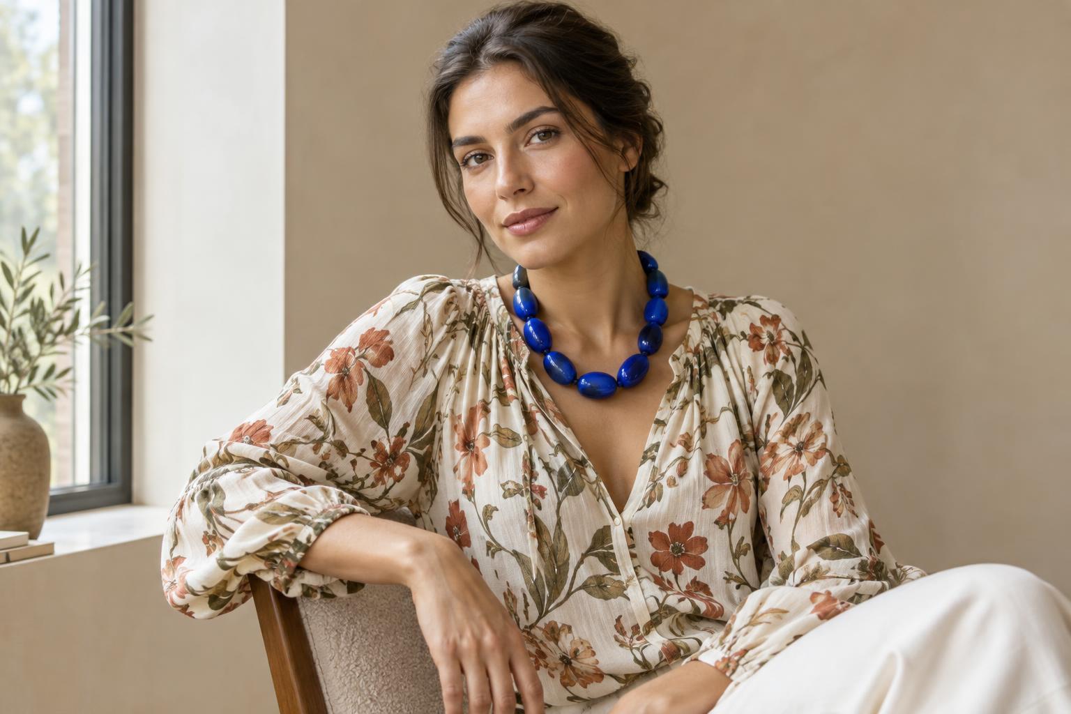
One way to connect an accessory to a print is through a shared colour. It need not be the print’s dominant colour: picking up a small accent can make that detail easier to notice. A red bag, for example, might draw out a few red marks in an otherwise blue and cream pattern. If a colour match feels too deliberate, try a related colour or a neutral that gives the print room to speak.
Shape offers another connection. Round earrings can echo curved motifs; a rectangular bag can bring structure to a loose, wandering print. Repetition creates a sense of intention, but contrast can be just as useful. A simple geometric accessory against a floral print gives the eye a clear shape to rest on without requiring the two pieces to look alike.
Texture changes the conversation too. A glossy accessory can stand apart from a matte printed fabric, while a woven or beaded piece may add another layer of detail. If several colours, shapes and textures are competing, keep one relationship clear. Let the accessory echo the print’s colour, for instance, while its shape remains simple.
Use scale and placement to create breathing room
Two bold pieces are easier to read when they do different jobs. With a large, expressive print, you might choose one accessory with a clear outline rather than many small details. With a fine print, an oversized cuff or substantial bag can provide a strong contrast in scale. Neither approach is automatically better; the useful test is whether you can still see the character of both pieces.
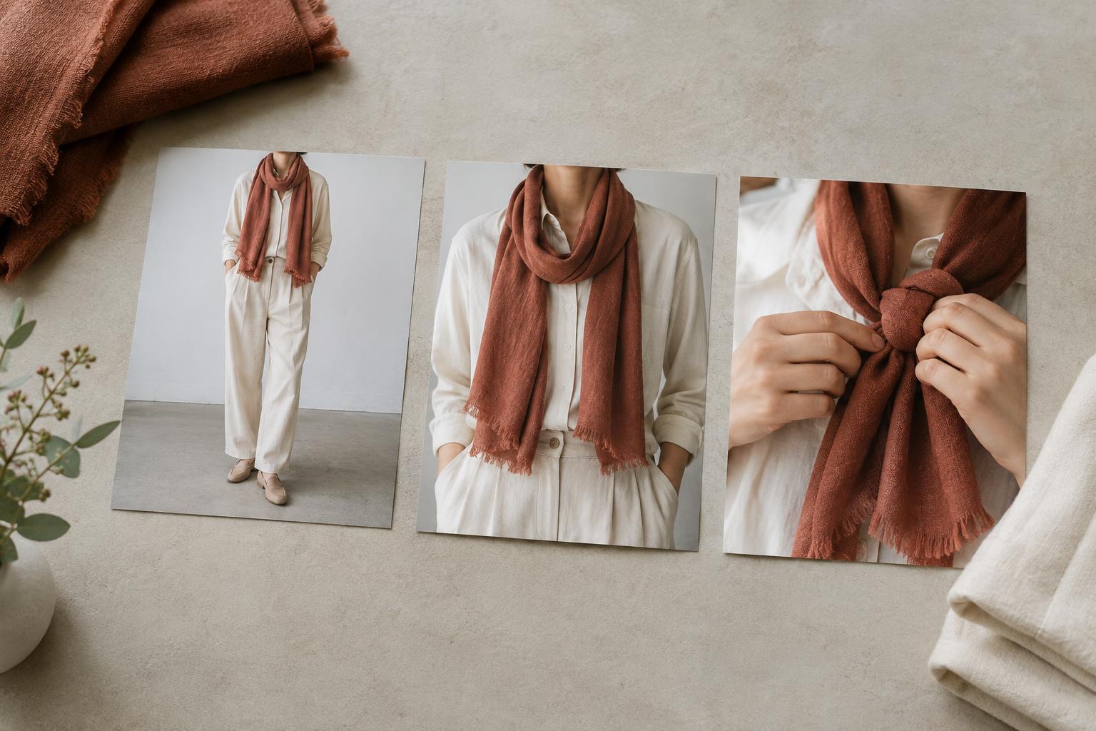
Placement can prevent crowding. Large earrings beside a busy collar may feel dense, while the same earrings with an open neckline may have more space. A patterned dress and a statement bag can work together because the bag is usually held away from the face. If an outfit feels busy, try moving the accessory before replacing it: carry the bag by its handle, wear the cuff on an uncovered wrist or choose a longer chain that sits below the printed neckline.
Leave room for comfort as well as appearance. An accessory that catches on textured fabric or needs constant adjustment will change how you move in the outfit. Check the combination while walking, sitting and putting on a coat.
Try a three-version outfit exercise
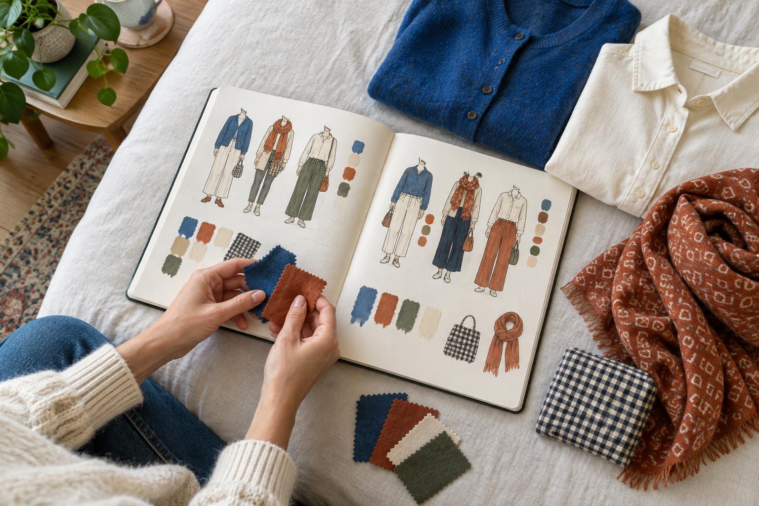
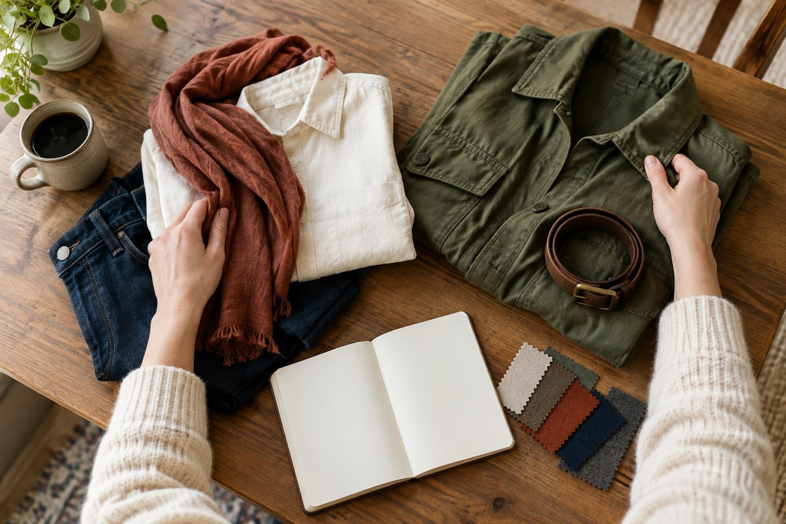
Choose one printed garment and one accessory you would like to wear more often. Build a simple outfit around the print, then take a mirror photo or make a quick note about how it looks without the accessory. Add the accessory and ask three questions: What do I notice first? Can I still appreciate the print? Does the combination feel like something I would enjoy wearing?
Next, make two small variations. In one, change the accessory’s position or how it is worn. In the other, change a supporting item, such as a plain top, shoes or outer layer. Keep the print and statement accessory the same so you can see what the adjustments accomplish. A quieter supporting colour may make both bold pieces easier to read; a different neckline may give them more separation.
Keep the version that feels most like you, even if it breaks a matching rule you have heard before. The point is not to make every detail equally noticeable. It is to decide which details tell the story of the outfit, and give each enough space to be seen.