Why a colour name is only the beginning
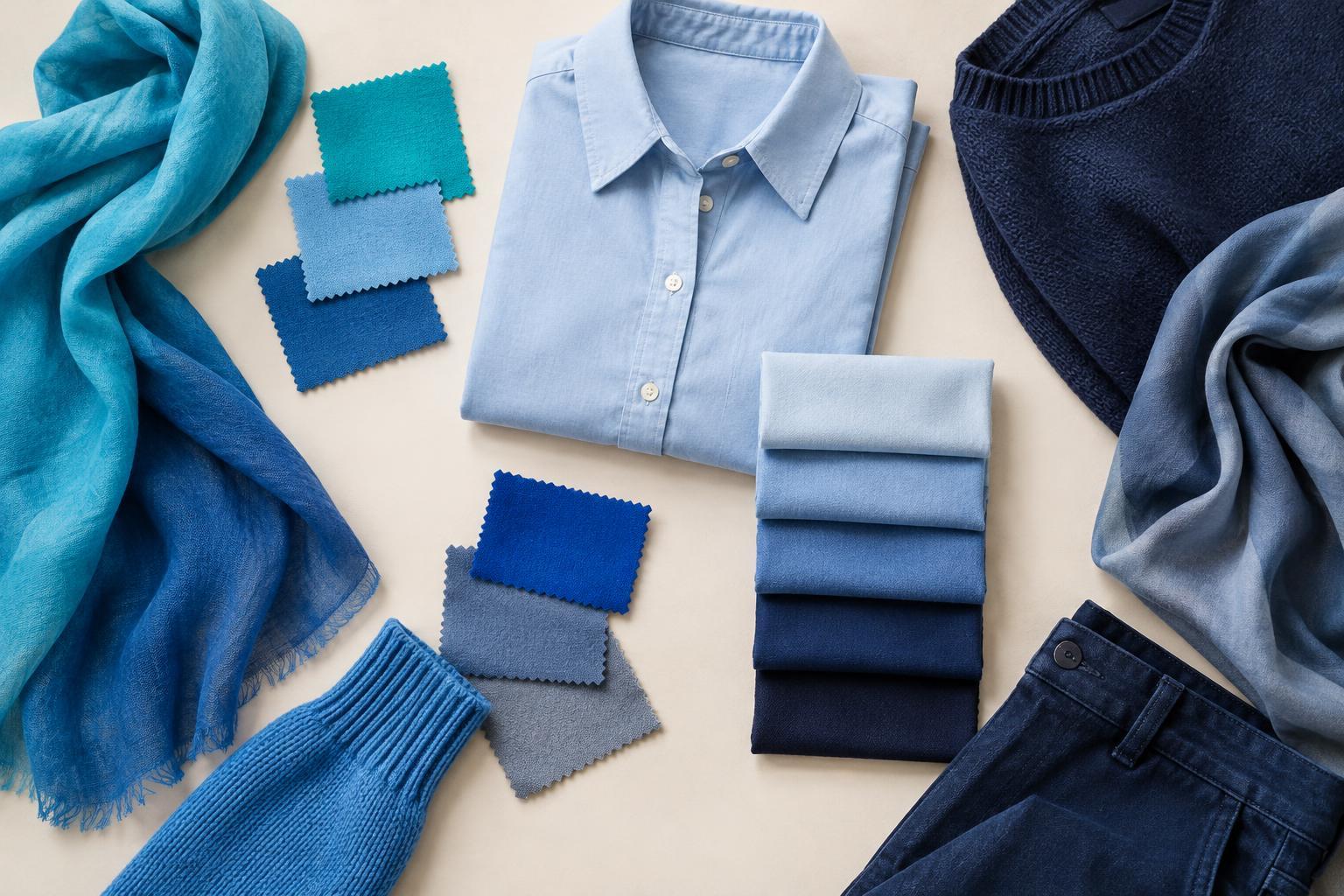
Imagine two blue shirts. One is pale and slightly grey; the other is deep and vivid. Calling both “blue” is accurate, but it does not explain why they create such different impressions or why you might reach for one more often. Hue, value and saturation give you three separate ways to describe what you see. You do not need to memorize a colour chart to use them. They are simply prompts for looking more closely.
These descriptions can help when you are choosing between similar garments, planning an outfit or identifying what feels out of place. Rather than deciding that a colour “doesn’t work,” you can ask a more useful question: Is it the kind of colour, how light or dark it is, or how vivid it looks?
Hue: What kind of colour is it?
Hue is the colour family you would name first: red, orange, yellow, green, blue or purple, for example. A garment can also sit between familiar names. A yellow-green scarf and a blue-green scarf are both greenish, but they bring different colours to mind. In everyday clothing descriptions, words such as coral, olive and teal can be helpful shorthand, though people may use those names differently.
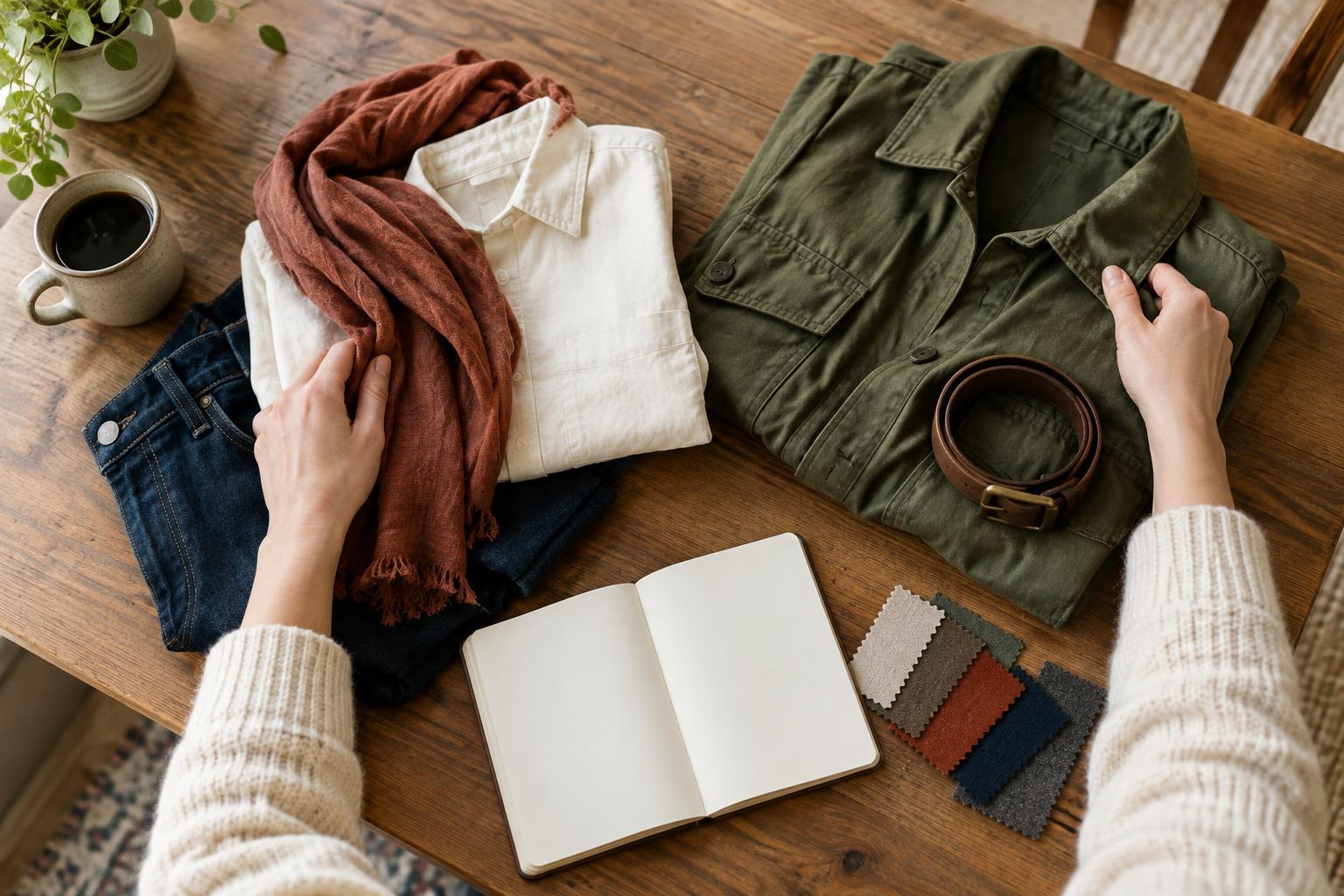
To notice hue, compare a garment with another piece rather than judging it alone. Put a reddish-brown belt beside an orange-brown one, or compare two pink tops to see which leans more toward purple. This is especially useful when you want colours to echo each other without matching exactly. It can also explain why two pieces labelled with the same colour name look noticeably different together.
Value: How light or dark does it look?
Value describes a colour’s apparent lightness or darkness. Pale blue has a light value; navy has a dark value. A garment’s value affects the overall light-and-dark pattern of an outfit, even when its hue is subtle. A cream shirt against dark trousers creates a clear contrast. A medium-grey shirt with medium-blue trousers may create a softer transition.
One way to study value is to narrow your eyes slightly while looking at an outfit. Small details become less distracting, and the broad areas of light and dark may be easier to notice. You can also view a photo of your clothes in black and white: the hues disappear, while differences in value remain. Ask where your eye goes first. If a very light bag stands out against an otherwise dark outfit, you can decide whether you want it to be the focal point.
Saturation: How vivid or muted is it?
Saturation describes the intensity of a colour. A bright, clear red appears more saturated than a dusty or greyed red. Low saturation does not mean boring, just as high saturation does not automatically mean bold. Placement, garment size and neighbouring colours all affect the result. A small vivid sock might feel like a quiet surprise, while a coat in the same colour occupies much more of the outfit.
Try placing a muted item next to a vivid one in a similar hue. A soft sage shirt beside a bright green scarf makes the difference easier to see than either piece alone. Then try each with the same neutral trousers. Notice whether you prefer the calmer combination, the sharper contrast or a little of both. This exercise is about recognizing your choices, not finding a correct level of saturation.
Use all three to make more intentional outfits
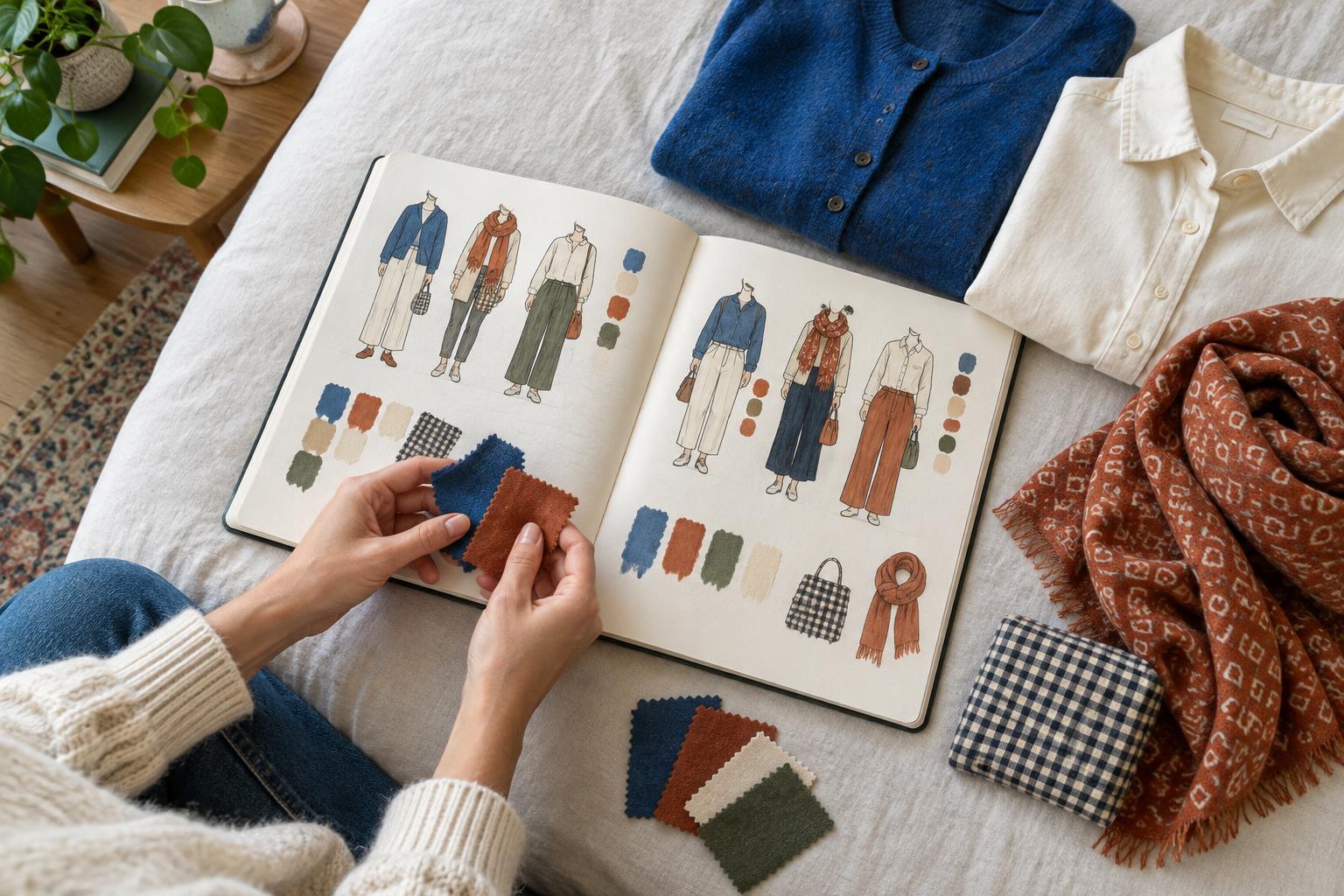
Choose one piece you enjoy wearing and describe it in three parts. Instead of “green sweater,” you might say “yellow-leaning green, medium-dark, muted.” Now look for another item that shares one quality with it. A patterned scarf could repeat its hue while adding lighter values. A bag could match its muted saturation without being green at all. Repeating one characteristic can give separate pieces a sense of connection without making them identical.
Next, change just one thing. Swap a light shirt for a dark one while keeping the rest of the outfit in place, or replace a muted accessory with a vivid version in a similar hue. Pay attention to what shifts: the focal point, the contrast or the mood you associate with the combination. It may help to take photos in consistent lighting so you can compare the outfits later. Colour can appear different under different lights and next to different materials, so treat your descriptions as useful observations rather than fixed labels.
The goal is not to sort your wardrobe into strict rules. Hue, value and saturation give you a vocabulary for experimenting. Once you can tell whether a colour feels too bright, too dark or simply different from the hue you expected, you have a clearer starting point for expressing what you want your clothes to say.