Give each print a different job
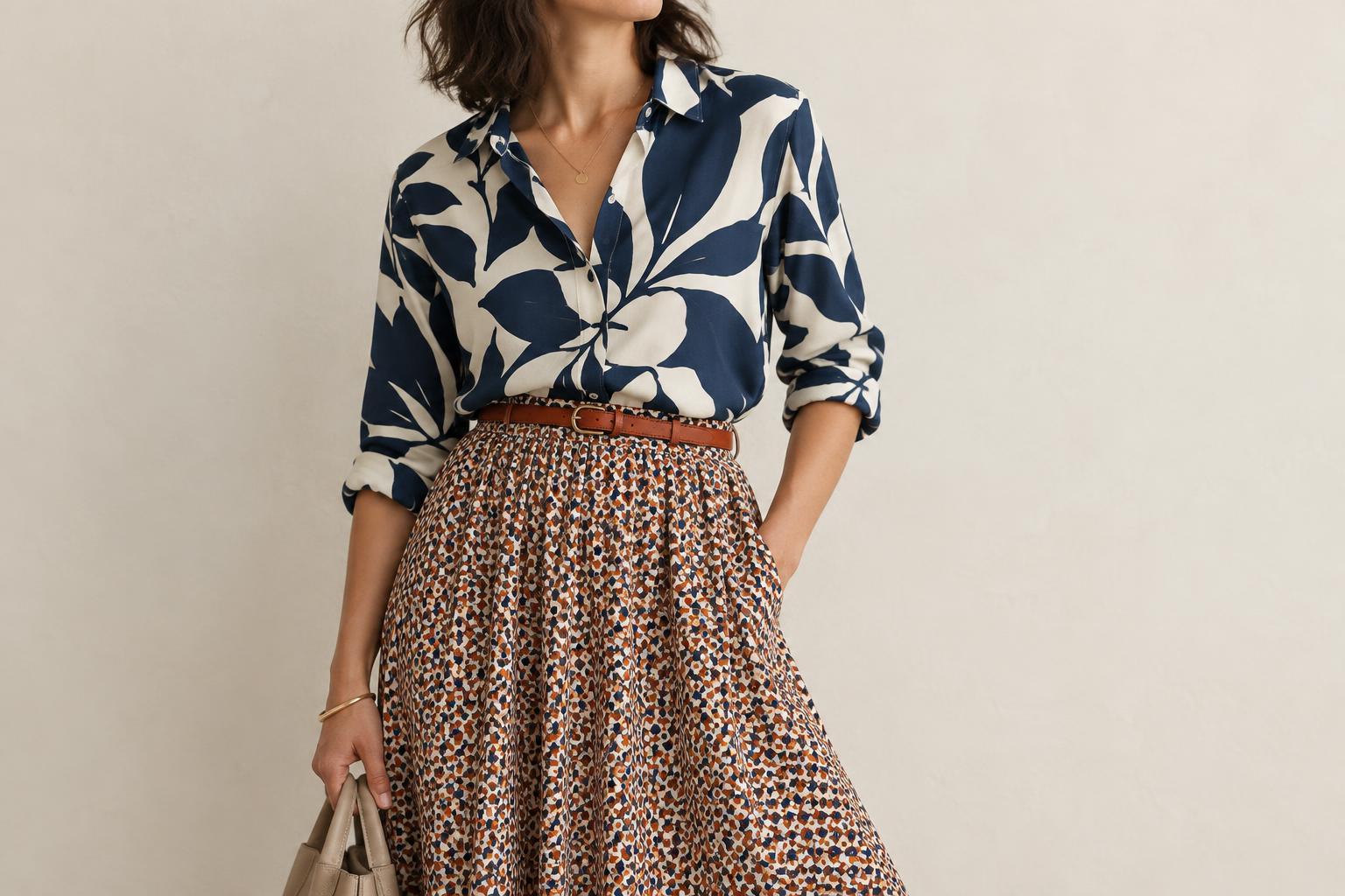
Mixing prints can feel difficult when every pattern asks for the same amount of attention. Scale offers a useful starting point: choose one print with large, easy-to-see shapes and another with smaller, denser marks. The difference gives the eye a place to begin. A wide floral with fine stripes, for example, usually reads differently from two florals with similarly sized blooms competing for space.
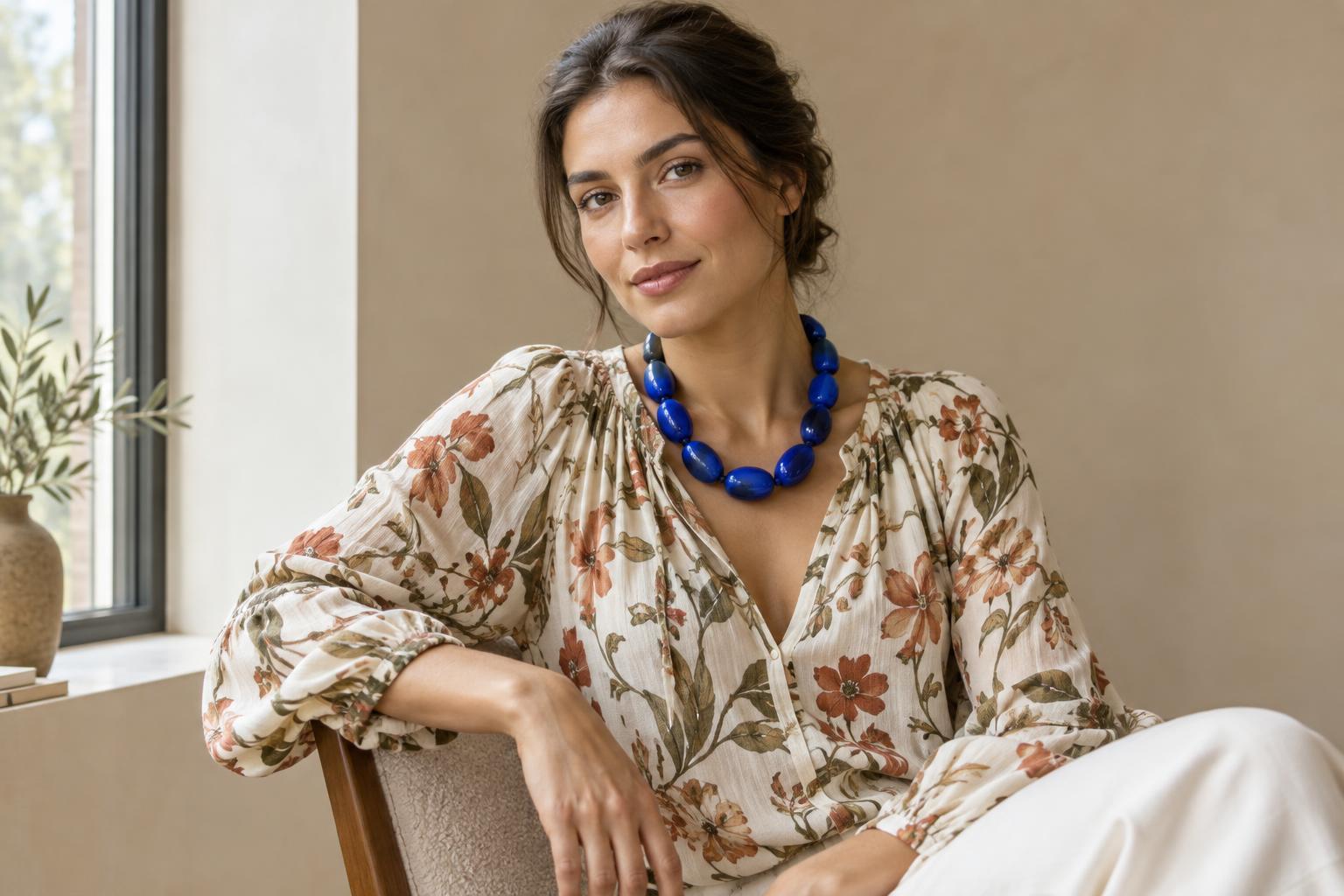
Think of the larger print as the lead and the smaller one as supporting detail. This is a starting point, not a rule about which item must be worn where. A large-print scarf can lead an outfit just as effectively as a printed jacket. What matters is that the patterns remain distinct when you see the whole look, rather than only when you inspect each fabric up close.
Judge scale from outfit distance
A print’s size is relative to both the garment and the person wearing it. Dots that look tiny on a full skirt may feel prominent on a narrow belt. Before deciding whether two prints differ enough, lay the pieces together or try them on and step back from the mirror. If both patterns merge into similar-looking visual noise, replace one with a design that has noticeably larger shapes or more open space.
You can also use the area each print covers to control emphasis. A large patterned shirt paired with a small-print neck scarf keeps most of the outfit’s visual weight in the shirt. Reversing the areas—a small-print dress under a bold, large-print layer—changes the focal point. Neither arrangement is inherently better; choose the one that directs attention where you want it.
Connect the patterns through colour
Different scales help prints coexist, while colour can help them feel related. One straightforward method is to repeat a colour across both patterns. A large blue-and-cream check might sit comfortably beside a fine blue stripe because the shared blue provides a link. The colours do not need to match perfectly, but they should look intentional together in the light where you plan to wear them.
If a shared colour is hard to find, try a shared background instead: two prints on cream, navy or another repeated base can feel connected even when their motifs differ. For a more varied palette, limit the rest of the outfit to quieter colours. Solid shoes, a plain bag or an unprinted layer can give the patterned pieces room to be noticed without requiring every item to coordinate precisely.
Notice contrast and breathing room
Scale is not the only reason a print stands out. High-contrast black-and-white pinstripes may attract more attention than a large, softly coloured botanical design. When you compare two patterns, notice their colour contrast, density and placement as well as the size of their shapes. If a supposedly small supporting print keeps taking over, you might choose one with gentler contrast or wear less of it.
Plain space can make a mixed-print outfit easier to read. A solid cardigan between a printed top and skirt creates separation, while an unpatterned belt can mark a clear boundary where two prints meet. You do not always need a buffer: a tiny dot beside a broad stripe can look clear on its own. Use plain pieces when they help the outfit express your idea, not because mixed prints automatically need calming down.
Try a three-step outfit exercise
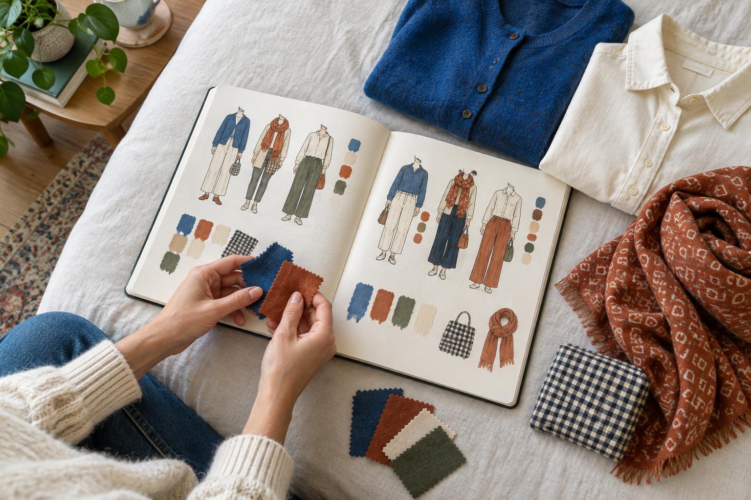
Start with a patterned piece you already enjoy wearing. Identify its most visible shape, then choose a second print whose shapes appear much smaller when the items are viewed together. Look for one connecting colour and put the pieces on with otherwise simple clothing. Step back, or take a full-length photo, to see which print catches your eye first and whether that matches your intention.
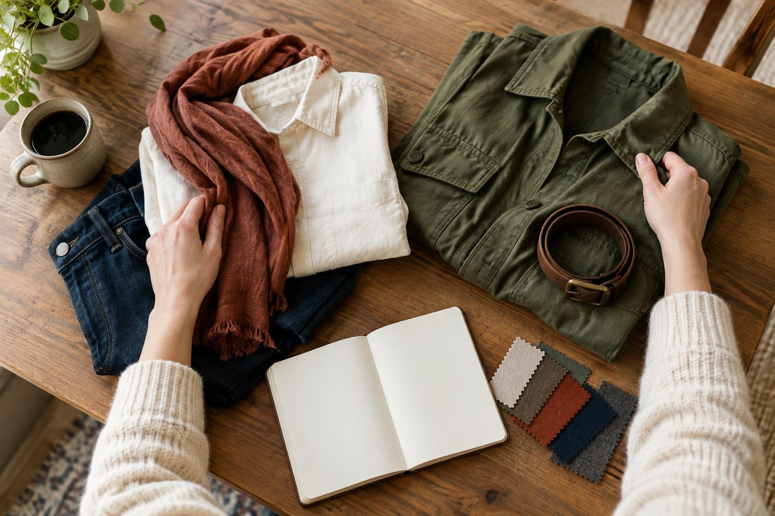
Change one thing at a time if the combination feels off. Try a smaller area of the second print, swap a high-contrast piece for a softer one, or add a solid layer to separate the patterns. Keep a note or photo of combinations you like. Over time, you may find that you prefer bold contrasts, subtle links or an unexpected clash. Scale gives you a way to make those choices deliberately while leaving room for your own visual voice.