Why almost matching can feel awkward
You pick up a blue scarf to wear with a blue coat. Separately, they seem like the same colour; together, one looks slightly greener. That small difference can make the pairing feel accidental, as though you were aiming for an exact match and missed. It can also make the outfit more interesting. The difference lies less in the colours themselves than in how you arrange the rest of the look.
An exact match creates a clear visual connection. A near match asks the eye to notice a relationship and a difference at once. Rather than hiding that difference, give it a role: make it part of a range of shades, repeat one of the colours elsewhere, or let texture explain why the two surfaces look unlike each other.
Look beyond the colour name
Names such as cream, olive and burgundy cover wide ranges. Before pairing two pieces, look at them side by side in the light where you expect to wear them. Ask three questions: Is one noticeably lighter or darker? Does one lean warmer or cooler? Does either surface reflect light? A pale yellow-leaning cream and a grey-leaning cream may seem close in a wardrobe but distinct when worn together.
Texture changes the comparison, too. Satin catches highlights, knitwear casts tiny shadows, and leather may have a sheen that makes its colour appear deeper. A smooth shirt and a fuzzy cardigan do not need to match as closely as two smooth shirts might. Their different materials give the eye another reason to read them as separate layers.
Give the difference a clear purpose
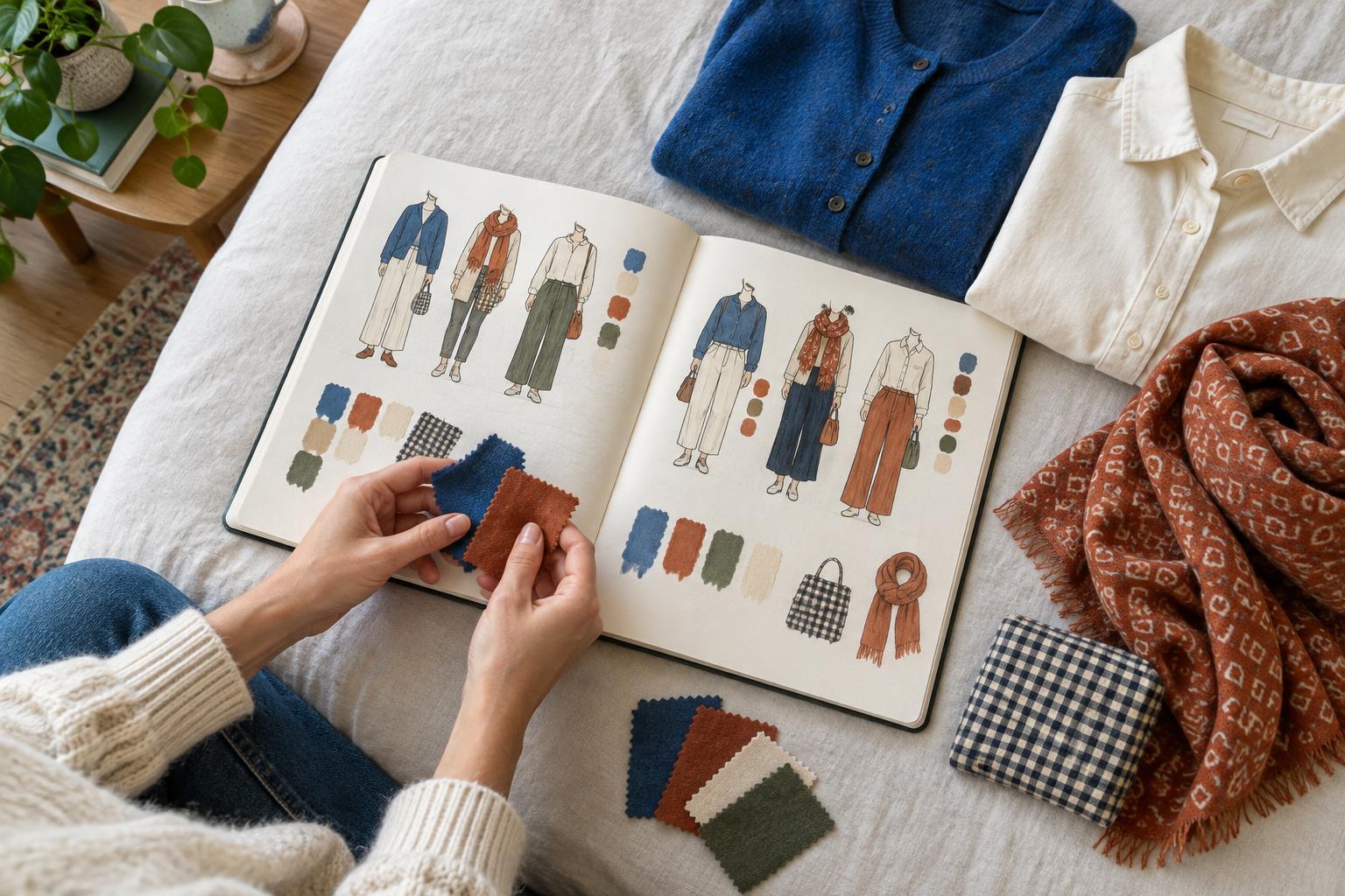
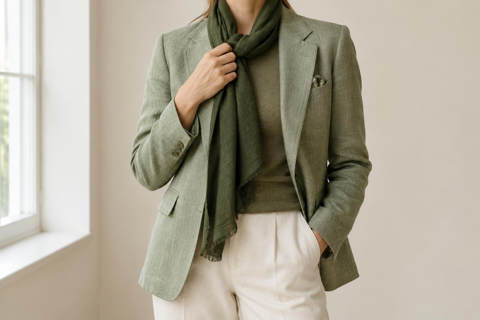
One approach is to build a small colour range. Pair a pale blue shirt with a deeper blue jacket, then add an accessory that sits between them. The middle shade makes the variation feel like a sequence rather than a comparison of two pieces. You can try the same idea with light-to-dark greens, warm browns or muted pinks.
Another approach is repetition. If your trousers are a little warmer than your nearly matching top, repeat the trouser colour in a belt, bag or small detail of a pattern. The repeated shade gives it a place in the outfit. Repetition need not be exact or prominent; even a modest detail can help establish a visual connection.
If neither approach suits the outfit, create separation. A white shirt collar between a cream sweater and an ivory jacket gives each near match its own boundary. A visible belt can do the same for a top and trousers. This works especially well when two similar colours meet across a large area.
Use pattern and neutral space with restraint
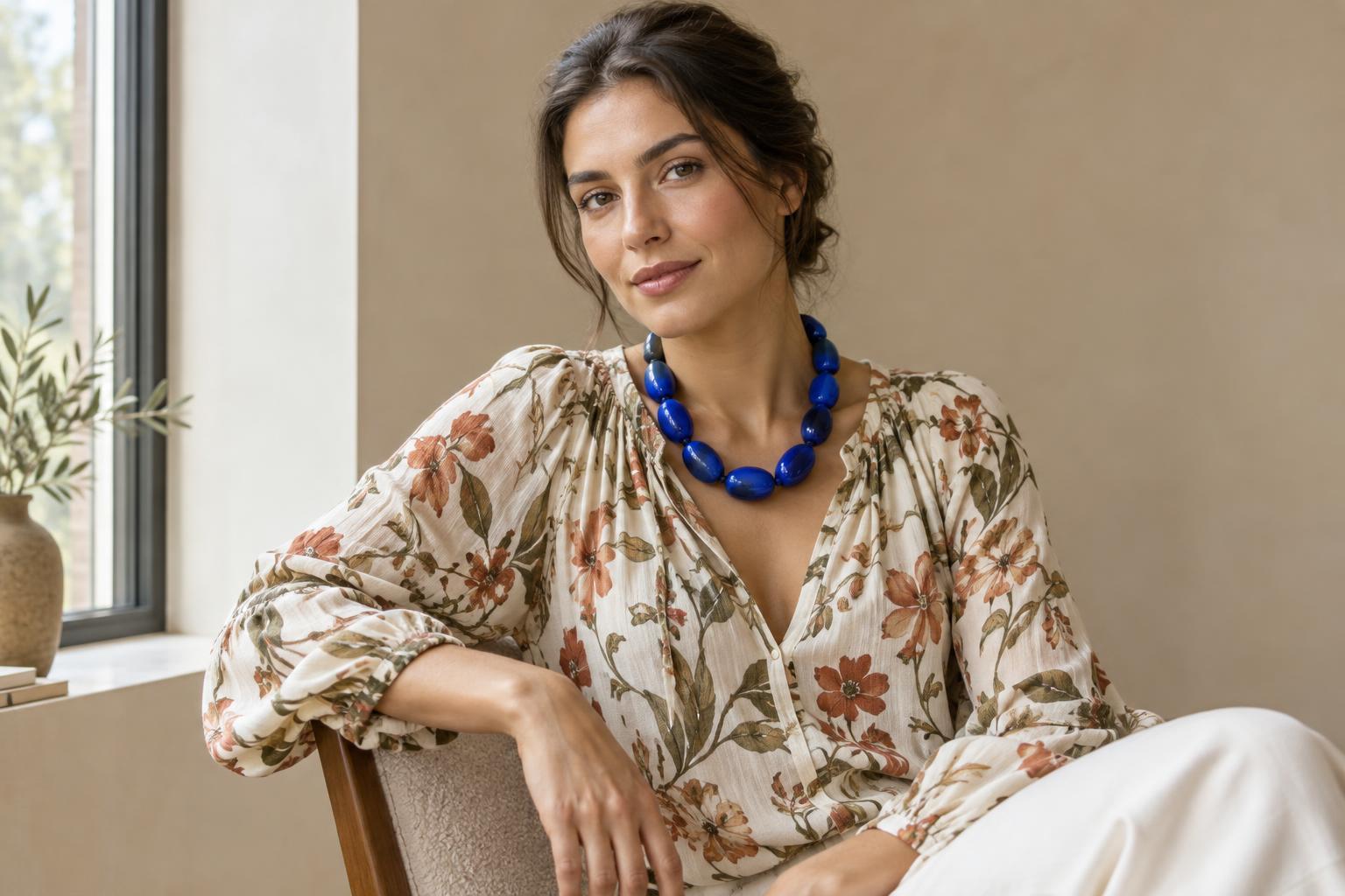
A patterned piece can connect two almost-matching colours if it contains hints of both. For example, a scarf with several greens can make a moss-coloured coat and an olive bag look like part of a shared palette. The pattern does not have to reproduce either colour perfectly. Its job is to show that variation belongs in the look.
Neutral space offers a quieter solution. Black, white, grey or denim can sit between near matches and reduce the pressure on them to agree. If a rust sweater and reddish-brown trousers feel too close, a visible white tee or a denim layer can give the eye a pause. Choose the amount of space according to the effect you want: a thin edge preserves a tonal look, while a larger neutral area makes each colour more independent.
There is no need to add every possible bridge. A middle shade, a pattern and several accessories may make a simple idea feel busy. Start with one device, then check whether the pairing already makes sense.
Try a five-minute near-match exercise
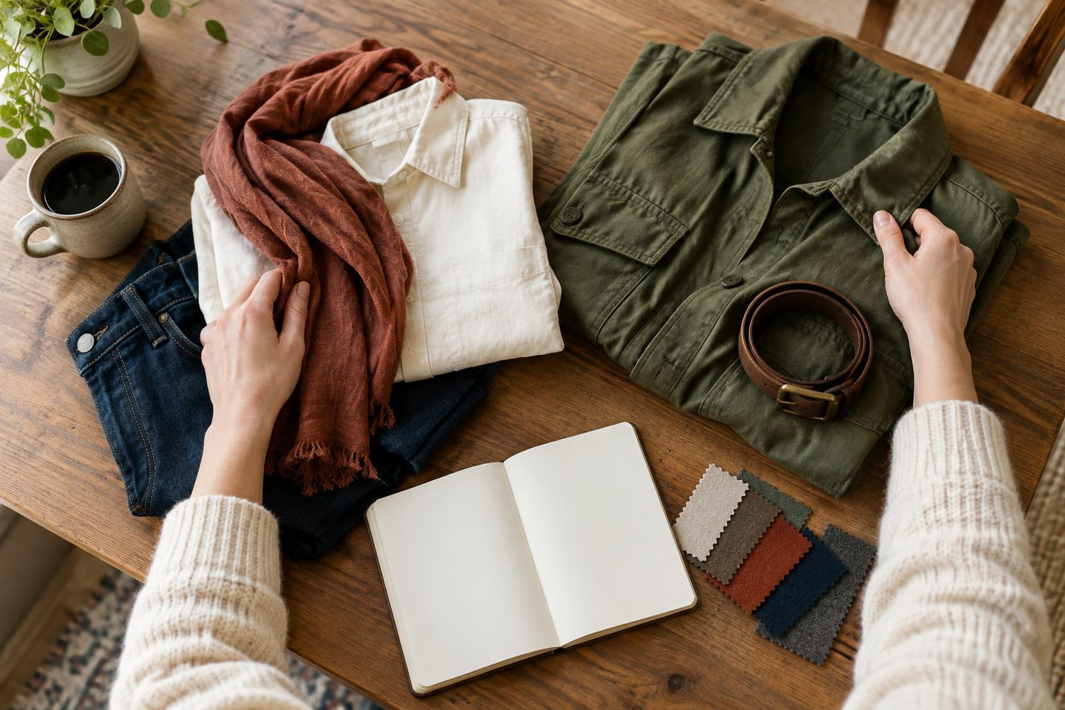
Choose two items you like but rarely wear together because their colours are not quite the same. Lay them beside each other, then view them from a few steps away. Notice whether the difference comes mainly from lightness, warmth or texture. Decide whether you want the result to feel softly tonal or clearly layered.
Now make three quick versions of the outfit. In the first, wear only the two items and your usual basics. In the second, add one piece that repeats either shade. In the third, place a neutral or contrasting boundary between them. If you can, take a photo of each version: a smaller image can help you judge the overall shape and colour balance instead of concentrating on the point where the pieces meet.
Keep the version that feels most like you. Near-matching colours do not need to pass a matching test. They work when their slight differences look chosen—and when the outfit expresses what you wanted it to express.