What makes a print feel busy?
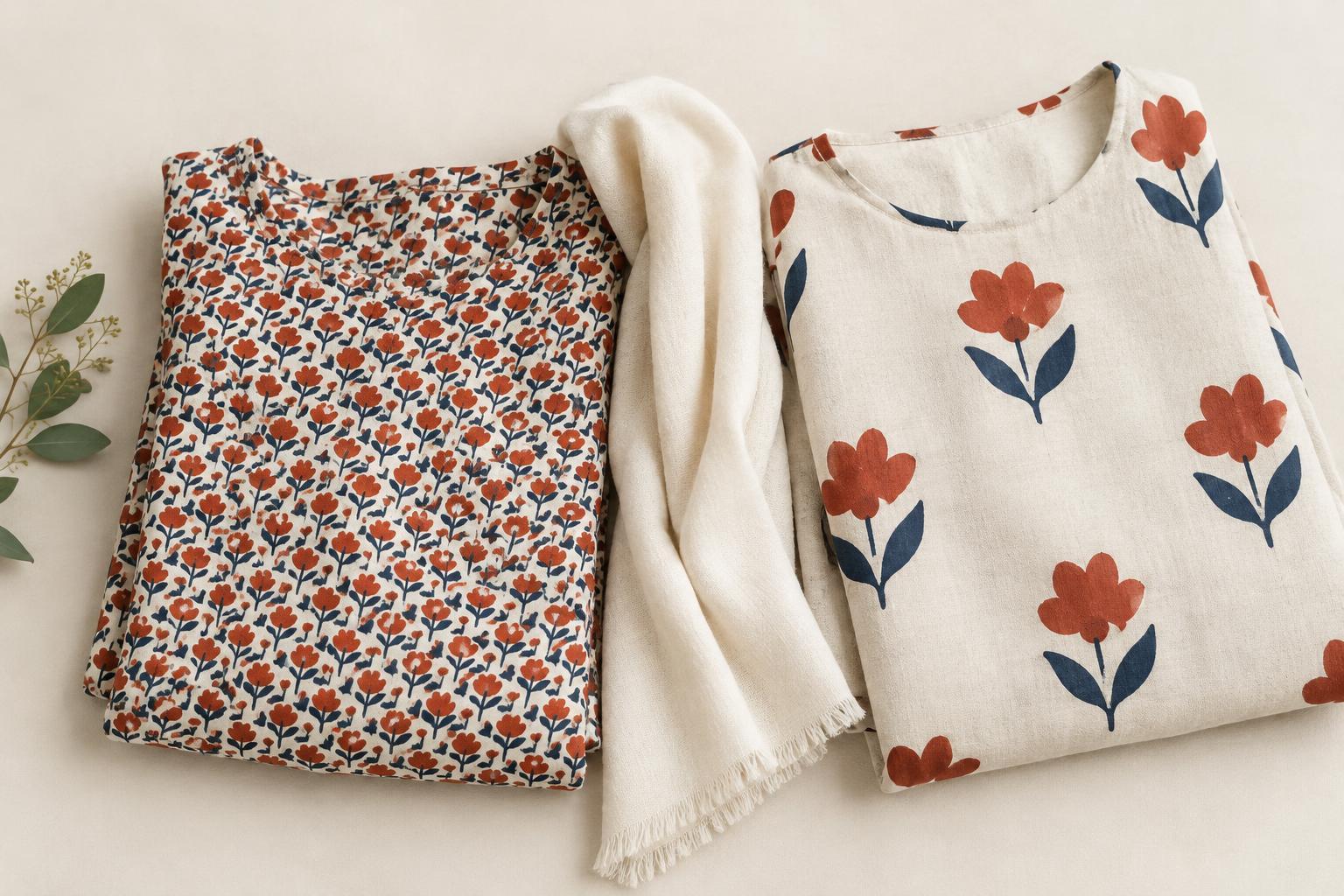
A print can feel calm or lively before you identify a single shape in it. One reason is pattern density: how much of the visible surface is occupied by motifs, lines and colour changes. Tiny flowers packed edge to edge may ask your eye to take in more information than a few large flowers on an open background. Neither approach is better. They simply create different kinds of visual energy.
Density is not just a count of motifs. Their size, spacing and edges matter too. A scattered print with irregular gaps can feel quieter than a neat grid of equally small shapes, even if both contain a similar number of elements. Look at the print from a few steps away as well as up close. At a distance, do its details merge into one texture, or does each shape still stand out? That shift helps explain why a fabric can seem subtle on a hanger and energetic when worn.
Give the eye somewhere to rest
Negative space is the area around and between the elements of a design. In a print, it might be a broad cream background between dark leaves or a narrow strip of blue separating geometric shapes. More visible background often gives each motif room to register on its own. When the gaps shrink, the motifs may compete for attention or blend into a continuous surface.
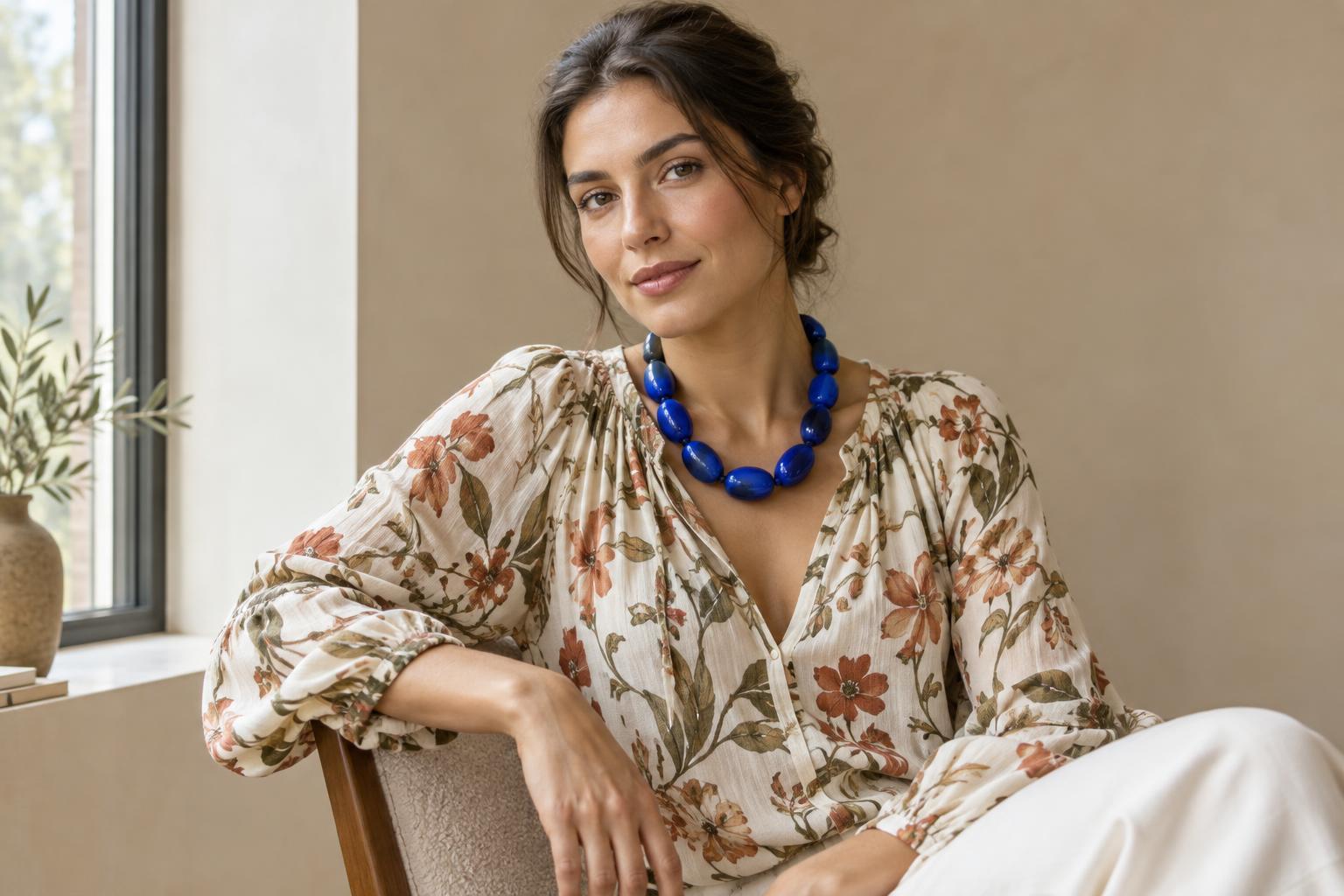
Negative space also exists outside the print. A patterned scarf against a plain top has a quieter setting than the same scarf against a striped shirt. A solid cuff, an unpatterned trouser leg or a glimpse of bare neckline can act as a pause in an outfit. If a print you love feels overwhelming, you do not necessarily need a different print. You may only need to change how much of it is visible and what surrounds it.
Contrast changes the volume
Spacing is only part of the story. Imagine the same small checks in black and white, then in two closely related shades of blue. The high-contrast version is likely to draw attention to every crossing line, making the pattern feel sharper and busier. The low-contrast version may read more like texture, particularly from farther away. Strong colour differences, crisp outlines and abrupt changes in lightness can all increase a print’s apparent activity.
Colour variety can have a similar effect. A pattern with several distinct hues gives the eye more changes to follow than one built from a limited palette. This does not mean a multicoloured print needs to be toned down. If its energy expresses what you want, let it lead. If you want a steadier result, repeat one of its quieter colours elsewhere in the outfit rather than trying to match every colour it contains.
Consider scale and placement on the body
Prints are experienced in the shape of a garment, not as flat samples. A dense pattern across an entire dress creates a different effect from the same fabric used for a collar or bag. Seams, folds and movement can interrupt a motif or bring several parts of it close together. A large print may also appear more open on a wide panel than it does on a narrow sleeve, where only fragments of the design are visible.
Placement lets you choose where the visual activity sits. A patterned skirt with a solid top concentrates attention lower down; a printed scarf brings it nearer the face. If an outfit feels crowded, try changing only one area: roll a sleeve to reveal a solid lining, leave space between a printed scarf and a patterned collar, or swap a patterned accessory for a plain one. Small adjustments can alter the rhythm without removing the personality.
Try a simple print-reading exercise
Choose two patterned items you own, or compare two prints you can see clearly. First, ignore whether you like them and describe what your eye encounters. Are the motifs large or small? Are the gaps generous or tight? Do the colours contrast strongly? Does the pattern have an even beat, or does it change across the surface? Then look from farther away and notice which details remain distinct.
Next, place each print beside a plain item, then beside another pattern. Notice whether the pairing offers a clear focal point or makes both pieces compete. You can also cover part of a print with a solid layer to test how the amount on display changes its impact. The goal is not to sort prints into rules such as “too busy” and “safe.” It is to recognize the visual pace you enjoy and choose when to amplify it, soften it or give it room to breathe.