Start with what you want people to notice
A print does more than add decoration. Its position can suggest where to look first and what to notice next. A patterned scarf draws attention toward the face, while printed shoes bring interest to the lower half of an outfit. Neither choice is automatically better; each gives the outfit a different emphasis.
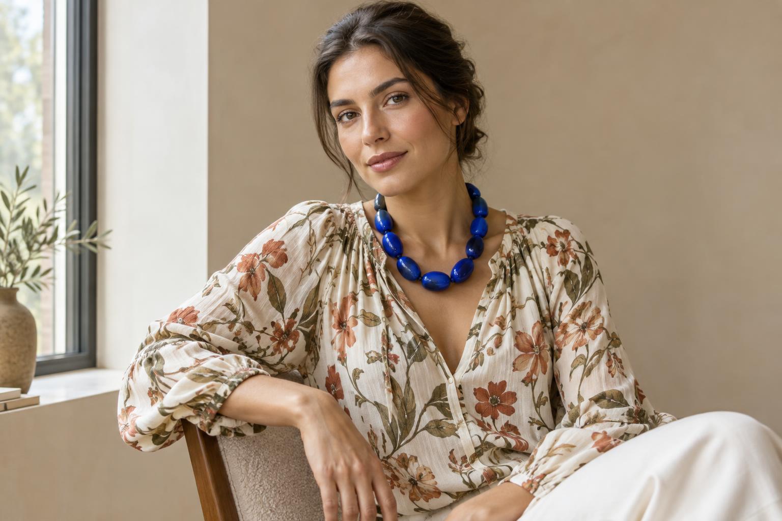
Before getting dressed, choose one feature you want to highlight. It might be a colour you enjoy, the shape of a jacket, or an accessory with a story attached. Then place a print where it supports that feature. If you want a vivid necklace to stand out, a print nearby in similar colours may help connect it to the rest of the outfit. If the necklace already makes a strong statement, a solid neckline may give it more room.
This is a useful way to think about print placement: not as a rule about which parts of the body should attract attention, but as a choice about the story your clothes tell.
Give a print a clear role
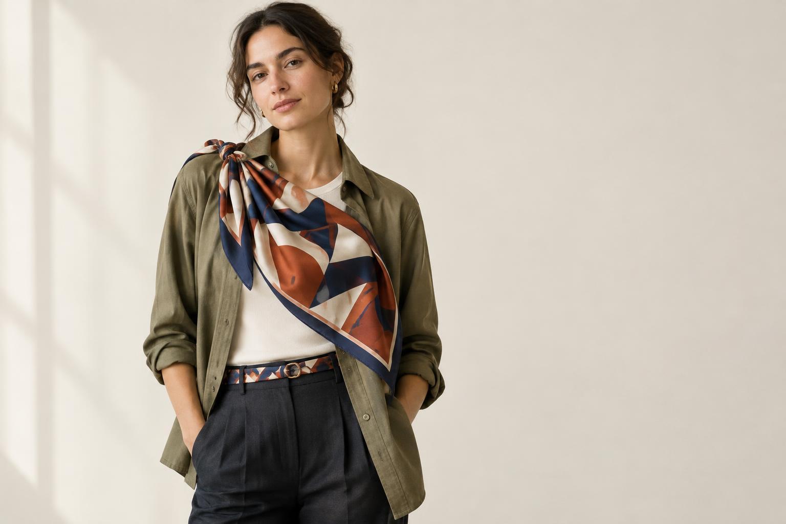
A printed piece can be the main event, a supporting detail or a link between other elements. A boldly patterned coat over simple separates becomes an obvious focal point. A small patterned pocket square adds interest without taking over. A belt that repeats colours from a shirt and shoes can make those separate pieces feel connected.
To give a print a leading role, surround it with quieter pieces. A floral skirt, for example, may read more clearly with a plain top and shoes in colours drawn from the fabric. The supporting pieces need not match exactly. Their job is to let the skirt's pattern remain the most detailed area.
If you prefer several points of interest, try placing them at different heights. Printed earrings and a patterned bag can create a visual path from top to bottom. Notice whether the two pieces feel connected through colour, shape or mood. They do not need to form a perfect set, but a shared detail can make the combination feel intentional.
Use scale and contrast to adjust emphasis
Placement matters, but so does how noticeable the print is. Large shapes, sharp colour differences and dense patterns often stand out more than small, low-contrast motifs. A fine stripe on trousers may act almost like a texture, while broad stripes on a top may become the first thing you see.
When combining prints, vary their scale to make each one easier to distinguish. You might pair a large checked overshirt with a small patterned scarf. Place the print you want to feature in the more prominent piece, then let the other add detail. If both seem to compete, try changing one item rather than abandoning the whole outfit.
Contrast offers another adjustment. A print in colours close to its background tends to feel quieter; one with light and dark areas side by side tends to feel more pronounced. You can use that difference to direct attention without changing where the garment sits.
Notice what layers reveal
A print's position can change as you move or add a layer. A patterned shirt under an open jacket appears as a narrow vertical area. Button the jacket, and the print may become only a glimpse at the collar and cuffs. A printed lining might stay hidden until you turn back a sleeve. These smaller appearances can offer personality without making the pattern the outfit's centre.
Think about the shapes created around a visible print. An open cardigan frames a patterned top; a solid shirt tucked into printed trousers creates a clear change at the waist. If an outfit feels visually busy, a plain layer can provide a pause between patterned areas. You can also repeat one colour from the print elsewhere, such as in a bag or socks, to connect distant parts of the outfit.
Check the outfit both standing still and in the way you expect to wear it. A print partly covered by a bag strap or outer layer may look different from how it appeared on the hanger.
Try a three-placement exercise
Choose one printed item you already own and build three outfits around it. First, make it the focal point with mostly solid pieces. Second, add one patterned or colourful accessory that relates to it. Third, use a layer to show only part of the print. Take a quick photo of each outfit in similar light, or look at each from a few steps away.
For each version, ask: Where do my eyes go first? What do I notice second? Does that order express what I want this outfit to say? If the answer feels off, change one thing: the accessory's position, the amount of print showing, or the contrast of a neighbouring piece.
The aim is not to find a single correct placement. It is to learn what different placements do, so you can choose deliberately. Once you know how to make a print prominent or subtle, it becomes another tool for expressing yourself.