Start with the kind of movement you want
A pattern does more than decorate a garment. It gives the eye a route to follow and helps set the mood of an outfit. Stripes tend to guide the gaze along lines. Checks create a repeated grid. Florals offer more varied shapes, often suggesting a looser, more organic rhythm. None has a fixed personality: colour, spacing, fabric and styling can make the same pattern feel quiet or emphatic.
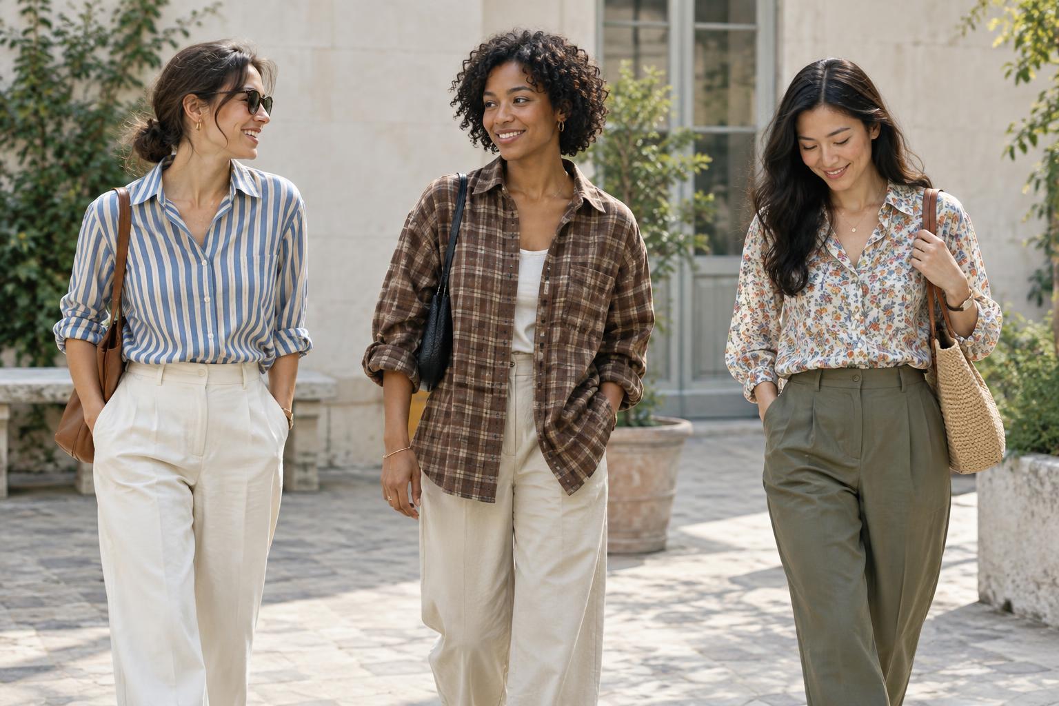
To compare them, imagine three shirts in the same cut and colours, each with a different print. The striped shirt may feel direct and ordered because its lines repeat in one direction. The checked shirt may feel more structured because lines cross. The floral shirt may feel softer or more animated because petals, leaves and gaps vary in shape. This is a useful starting point, not a rule about who should wear what.
Stripes: direction and repetition
Stripes are especially good at creating a clear visual path. Vertical, horizontal and diagonal stripes each direct attention differently, but their effect depends on more than orientation. A narrow, low-contrast stripe can read almost like texture from a distance. Broad stripes in sharply different colours are likely to become the outfit’s main feature. Irregular spacing adds a more playful feel than evenly spaced lines.
Try stripes when you want an outfit to look deliberate without using a detailed image or motif. A striped top beneath a plain jacket offers a glimpse of movement; a striped coat makes that movement the first thing people see. Avoid treating stripes as a guaranteed way to change how a body looks. Fit, garment shape, line width and viewing distance all contribute to the overall impression.
Checks: structure with room to play
Checks combine crossing lines with repeated blocks of space. Their grid can make an outfit feel grounded and organised, while an oversized or uneven check can feel bold. The scale matters: small checks often blend into a textured surface at a distance, whereas large checks remain easy to recognise. A check with several colours can also act as a bridge between other pieces in an outfit.
If a checked garment feels too busy, look at contrast before ruling out the pattern. A grid made from similar shades usually has a gentler effect than one built from dark and light blocks. You can also control its presence through placement. Checked trousers paired with a solid top keep the grid in one area; a checked bag introduces the same visual idea on a smaller scale.
Florals: shape, spacing and mood
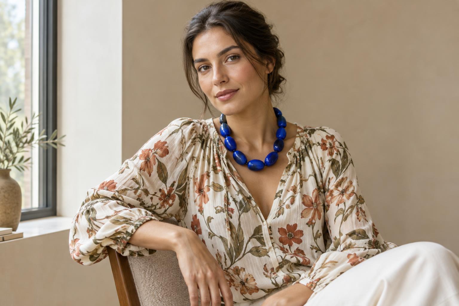
Florals do not automatically make an outfit romantic or delicate. A scattered print of small flowers may feel subtle, while large blooms with strong outlines can be graphic and assertive. A dense floral leaves little resting space for the eye; a sparse one lets the background colour play a bigger role. The shapes matter too: precise, repeated flowers feel different from loose, expressive ones.
Consider the background as carefully as the flowers. Dark petals on a pale ground may look crisp, while softly related colours can create a gentler impression. If you like the idea of florals but not an all-over print, start with a scarf, socks or bag. You still get the expressive shapes without asking the pattern to carry the entire outfit.
Compare patterns in your own wardrobe
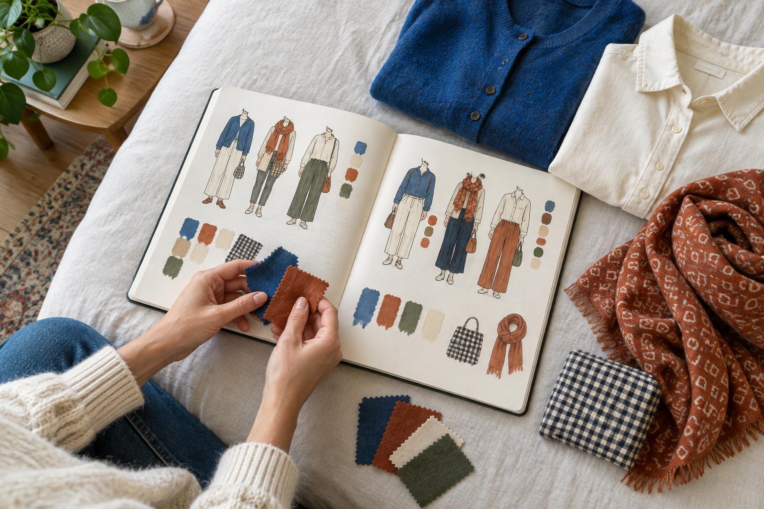
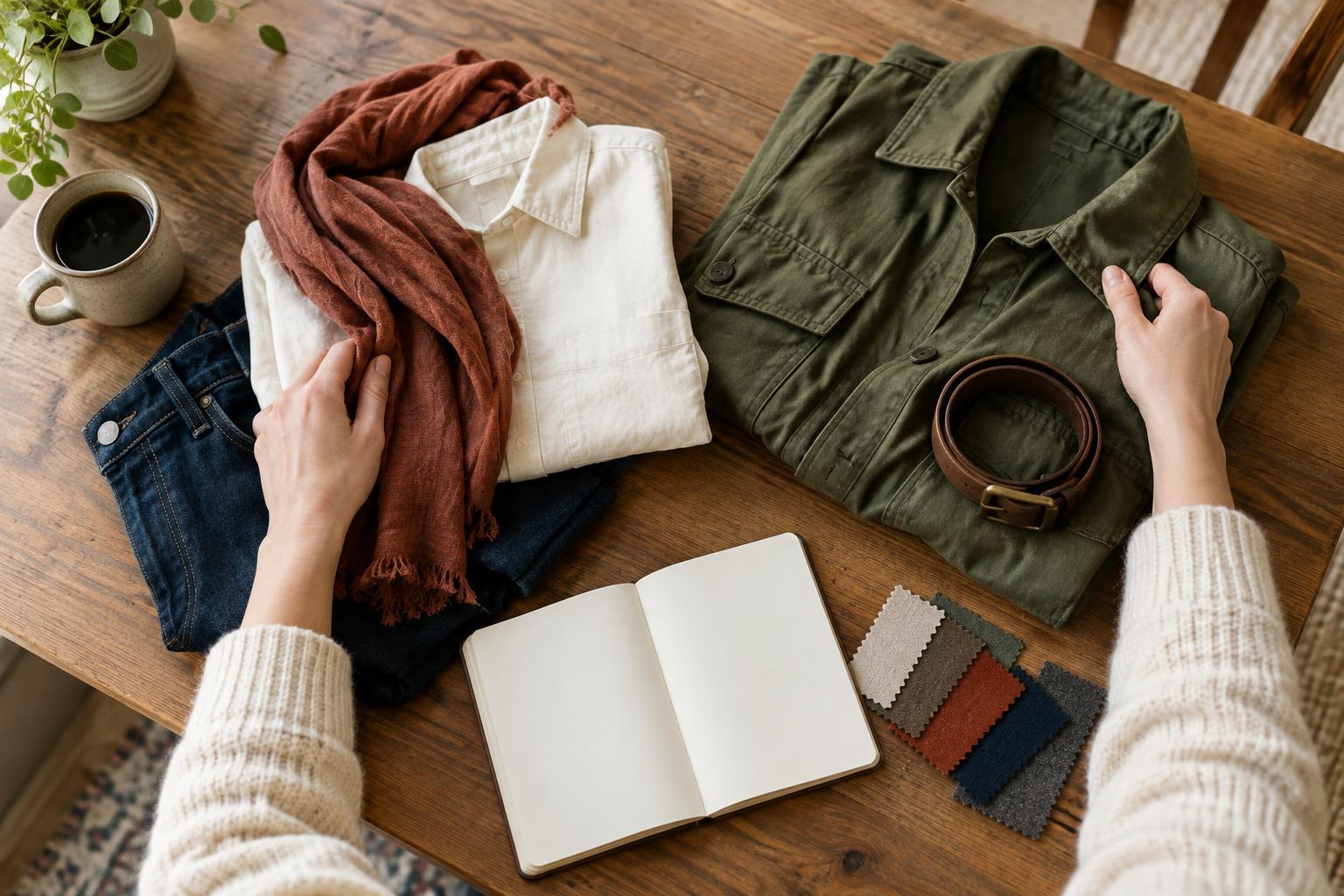
A simple comparison can help you separate your preferences from assumptions about a pattern. Choose one striped, one checked and one floral item, or use pictures of garments with similar cuts. Pair each with the same plain base outfit. Look first from across the room: which pattern registers immediately, and which reads more like texture? Then look closer. Notice the scale, colour contrast and amount of empty space.
Next, take a photo of each combination in similar light. Ask what you notice first and whether that matches what you want to express. You might prefer the order of checks for work, the clarity of stripes for an everyday outfit and the varied shapes of florals for a more expressive moment. Or you may discover that scale and colour matter more to you than pattern type. Use that observation when choosing your next piece: pick the visual effect you want, then find a pattern that creates it.