What the colour wheel can tell you
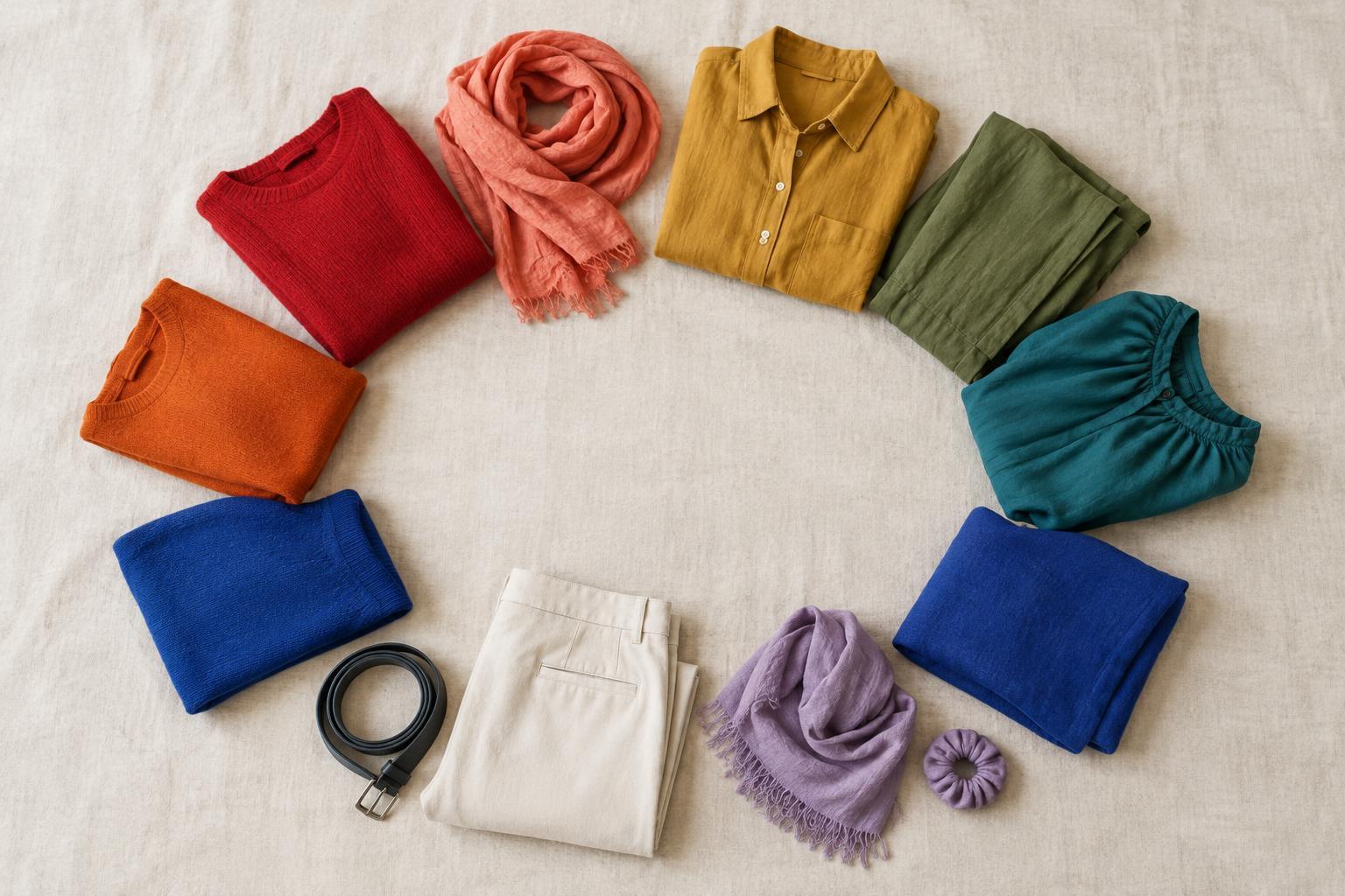
A colour wheel arranges hues in a circle so you can see how they relate. For clothing, you do not need to memorise colour theory or match a diagram perfectly. The wheel is a planning tool: it helps you choose colours that sit close together, face each other or form a wider spread. Those relationships can give an outfit a sense of calm, contrast or playful variety.
Hue is the colour family, such as blue, green or orange. Value describes how light or dark a colour appears, while saturation describes how vivid or muted it is. These distinctions matter because two outfits can use the same hue relationship and feel entirely different. A soft blue with dusty orange may look quieter than bright cobalt with vivid tangerine, even though both pair blue and orange. Start with the hues, then adjust their lightness and intensity to suit the effect you want.
Neighbouring hues: a gentle way to begin
Analogous colours sit beside one another on the wheel. Blue, blue-green and green are one example; red, red-orange and orange are another. Because the hues share some visual character, they can make a varied outfit feel connected. This is useful if you want more colour without a sharp divide between pieces.
Try choosing one colour as the main event and using its neighbours in smaller amounts. You might wear green trousers with a blue-green shirt and add a blue scarf. The pieces do not have to be equally bright. In fact, varying their value often makes each item easier to see. If three similar colours blend into one another, add a darker layer, a lighter accessory or a neutral such as cream or charcoal to give the outfit shape.
Opposite hues: contrast with a clear purpose
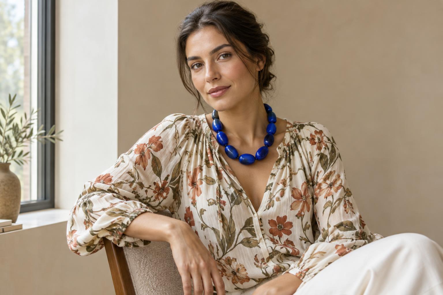
Complementary colours sit across from each other on the wheel. Common examples include blue and orange, red and green, and yellow and purple. This relationship creates noticeable contrast, which makes it useful when you want an accessory or detail to draw the eye. It does not mean wearing two vivid colours in equal amounts: a small orange bag can stand out against a blue coat without competing for space.
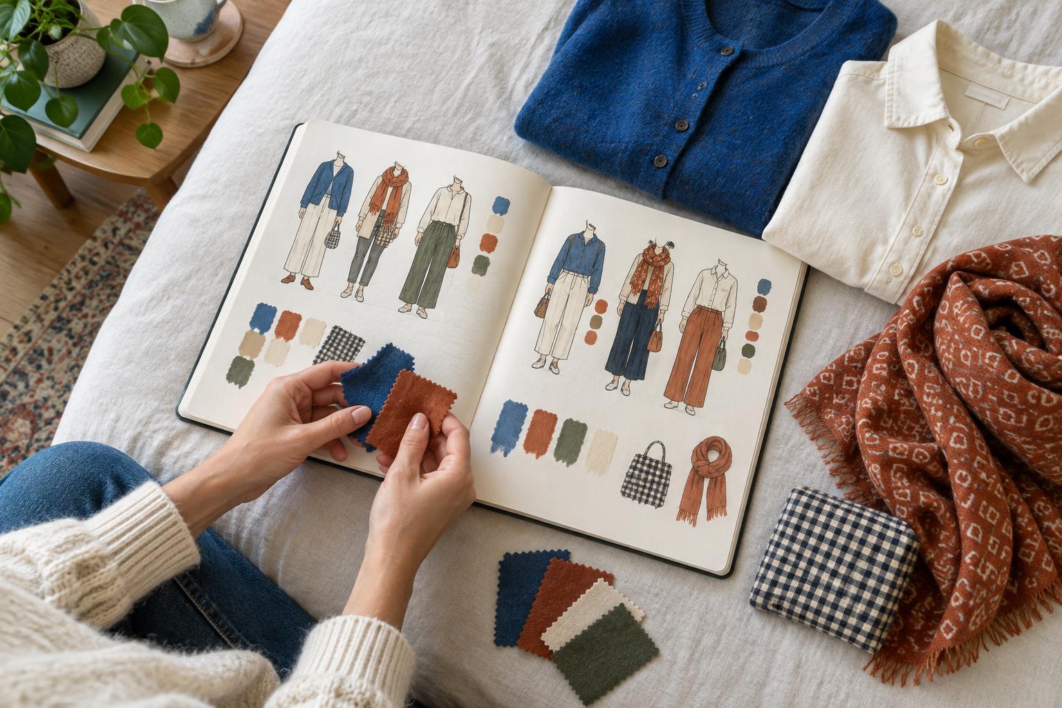
If a direct opposite feels too strong, soften one or both colours. Deep navy and warm rust are a more subdued take on blue and orange. You can also try a split-complementary combination: start with one hue, then choose the two hues on either side of its opposite. For example, blue can work with yellow-orange and red-orange. In an outfit, that might mean a blue base with two small, warm-coloured details rather than three large blocks of colour.
Three-way combinations and the role of neutrals
Triadic colours are spaced roughly evenly around the wheel. Red, yellow and blue form a familiar example. A three-hue outfit can feel energetic, but it is easier to manage when the colours have different jobs. Let one lead, give another a supporting role and reserve the third for a small accent. A blue outfit with a yellow knit and a narrow red belt, for instance, puts the relationship to work without asking every piece to be equally prominent.
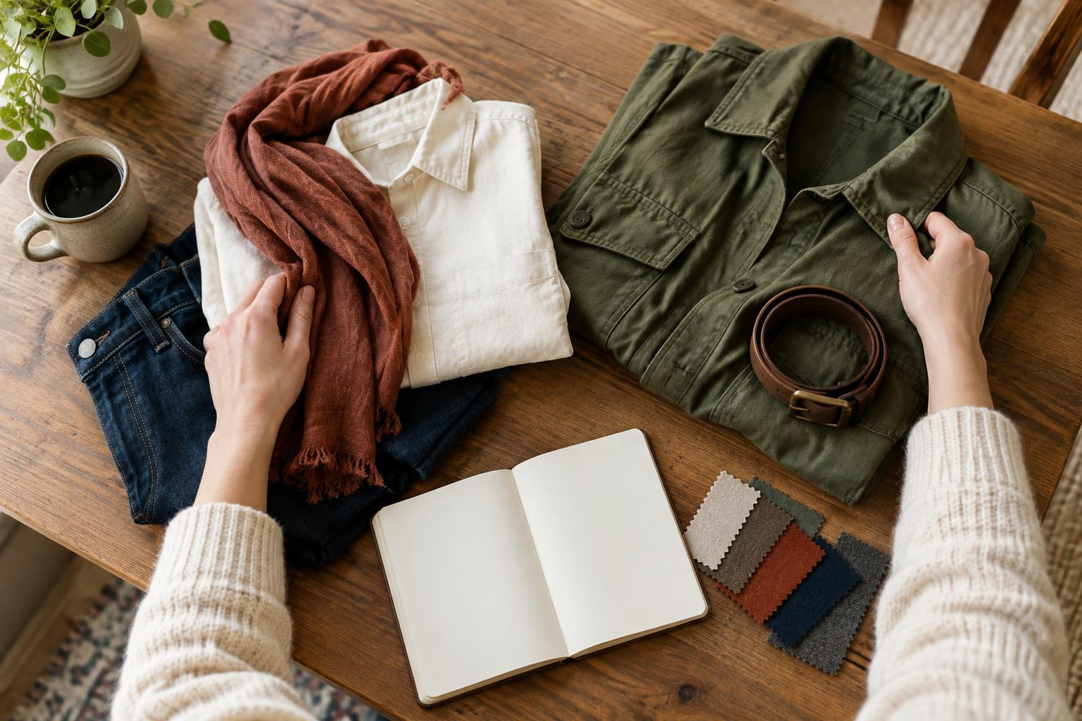
Neutrals help you control how much colour is visible. Black, white, grey and many shades of beige or brown can separate bright pieces or give a quieter combination more structure. They are not always visually neutral, though: a warm tan may feel more at home beside rust than icy blue. Notice the undertone of a neutral garment and treat it as part of the outfit rather than an invisible background. Denim can play a similar supporting role, depending on its shade.
A five-minute exercise with your own clothes
Choose one item you would like to wear more often and name its broad hue. Lay it on a bed or hang it where you can see it. First, find a piece in a neighbouring hue. Then look for one in a contrasting hue, whether it is a garment, bag, scarf or pair of socks. Make two outfits from those options and compare them. Which one directs attention to your chosen item? Which one feels more relaxed?
Next, change only one thing: the size, value or saturation of a colour. Swap a bright accessory for a muted one, or replace a large contrasting layer with a smaller detail. A photo can help you judge the whole arrangement from a distance. The wheel offers possibilities, not rules; texture, print, lighting and your own preferences affect how colours feel together. Keep the combination that communicates what you want, even if it does not fit a textbook pattern.