Think of temperature as a comparison
A warm colour often suggests yellow, orange or red; a cool colour often suggests blue, green or violet. That description is a starting point, not a permanent label for every garment. Two reds can feel quite different beside each other: one may lean toward orange, while the other leans toward violet. The useful question is not simply “Is this red warm?” but “Does this red look warmer or cooler than that one?”
Colour temperature is only one part of what you see. A pale, muted blue and a vivid navy may both seem cool, yet create different effects in an outfit. Fabric texture, shine, lighting and neighbouring colours also matter. Rather than sorting your wardrobe into two fixed camps, use warm and cool as words for differences you can observe. This leaves room for colours that sit somewhere in between and for pieces that change character depending on what you wear with them.
Set up a simple garment comparison
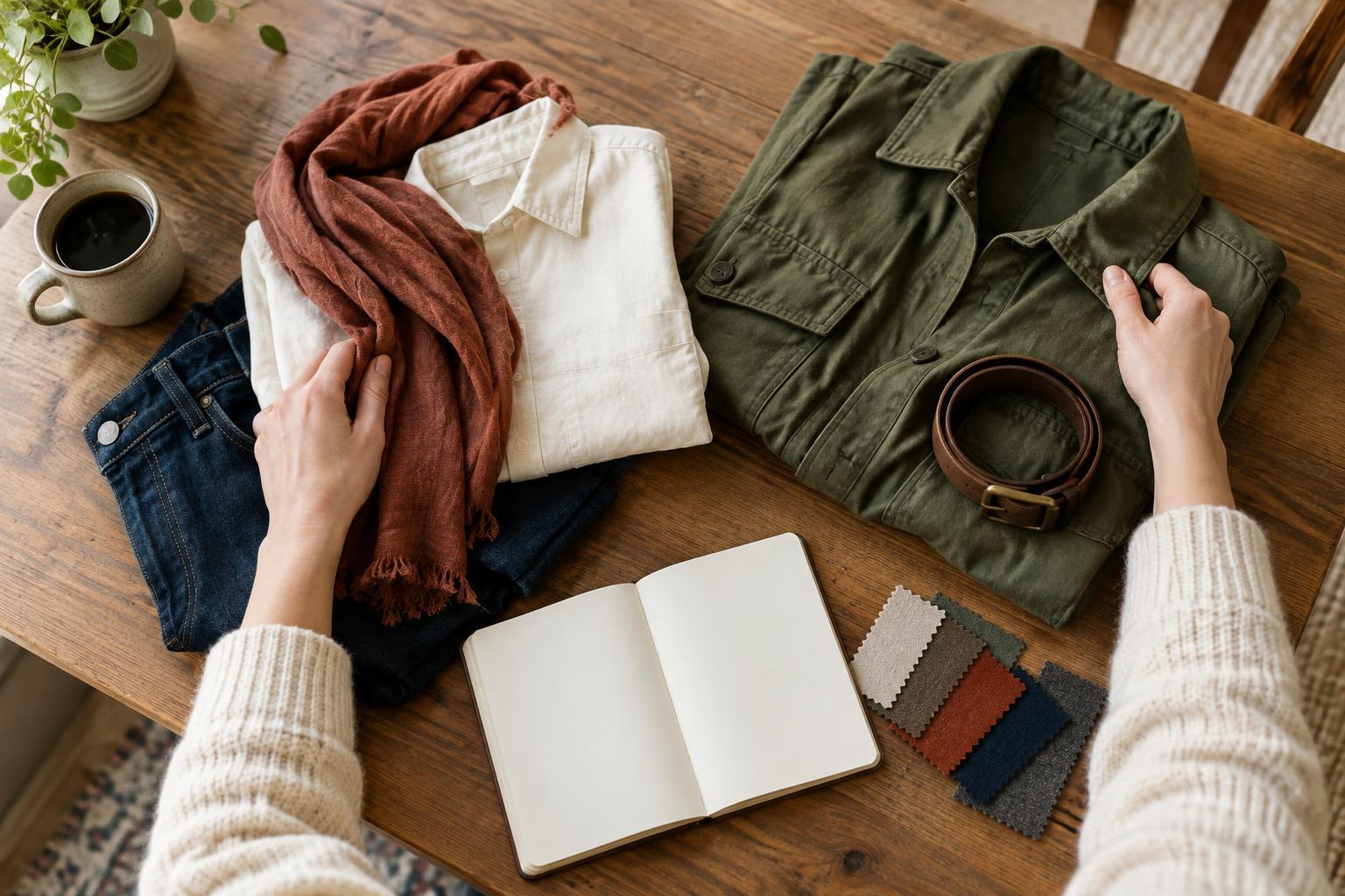
Choose two garments that serve a similar purpose, such as two shirts, scarves or jackets. Hold them beside each other in the same spot, ideally in steady daylight away from strongly coloured walls. Look first at the garments themselves. Which one appears more golden, peachy or earthy? Which appears more blue, rosy or crisp? If the difference is hard to see, compare a smaller area, such as two sleeves, rather than taking in each entire garment at once.
Next, try each piece with the same neutral item: a pair of trousers, a plain top or a coat you often wear. Keep everything else as consistent as you can. You may find that one combination looks softly blended while another has a sharper contrast. Neither result is automatically better. The exercise gives you a clearer description of each option and a more useful basis for choosing between them.
Notice what happens near your face
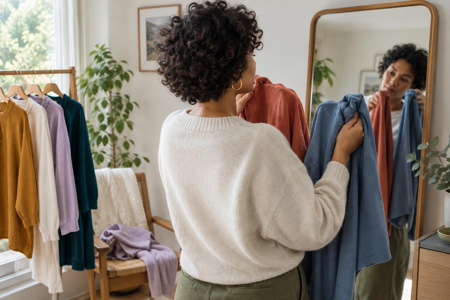
If you want to compare how colours look on you, place each garment near your face in turn. Use the same mirror and lighting, and keep your attention on specific impressions. Does one colour make the whole outfit feel lively? Does the other give it a quieter mood? You can also step back and ask which one fits the message you want to convey that day. A colour you enjoy wearing can be worthwhile even when it does not produce the effect you expected.
Try not to make a lasting judgment from one glance or one photograph. Indoor bulbs, phone cameras and even the colour of a nearby wall can alter what you see. Revisit a choice with different combinations if you are curious. Your preference may also vary by context: a bold contrast that feels right for an evening outfit might not be what you want for a relaxed afternoon.
Use contrast and repetition to make combinations
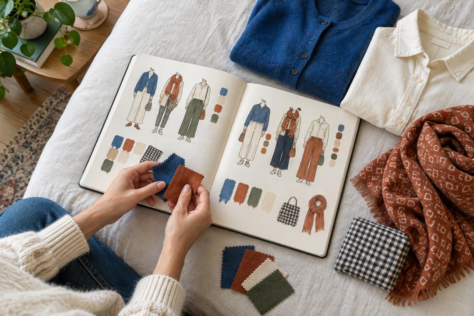
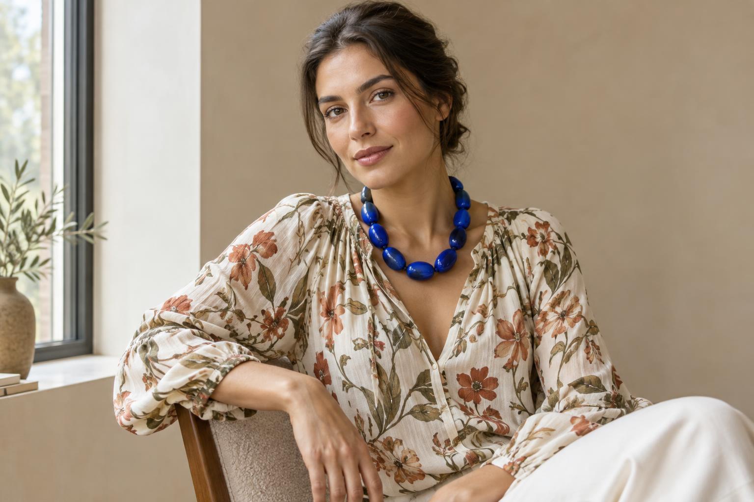
Warm and cool colours can sit together deliberately. A rust scarf against a blue coat, for example, creates a noticeable contrast. If the meeting point feels abrupt, repeat one of the colours elsewhere: a small warm detail in a bag or a cool tone in a patterned scarf can help the combination feel connected. Repetition need not be exact; a related colour is often enough to give the eye a path through the outfit.
You can also adjust how much space each colour occupies. A warm accent may feel easy to wear when it is a narrow belt, while a warm jacket makes a stronger statement beside cool trousers. Pattern offers another route: a print containing both colour directions can connect pieces that initially seem unrelated. Experiment with one change at a time so you can tell whether it is the colour, its placement or its scale that changes the outfit.
Keep a record of what you actually like
After a few comparisons, note the pairings you want to wear again. A short description is more helpful than a verdict such as “cool colours only.” You might write, “I like this blue with cream,” or “This orange works best for me as a small detail.” These observations can guide future outfits without turning a personal preference into a restriction.
The aim is to build a vocabulary for your own style. Warm and cool can help you spot subtle differences between garments, understand why a pairing feels calm or energetic, and make more intentional choices. If a combination breaks a colour rule but expresses what you want, you have learned something useful about your taste. Wear the combination.