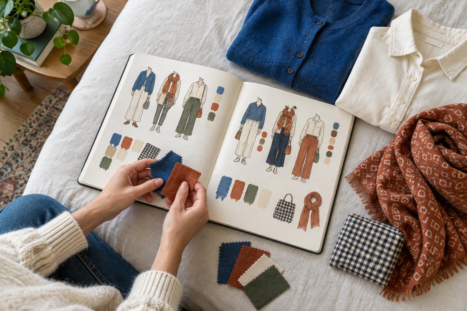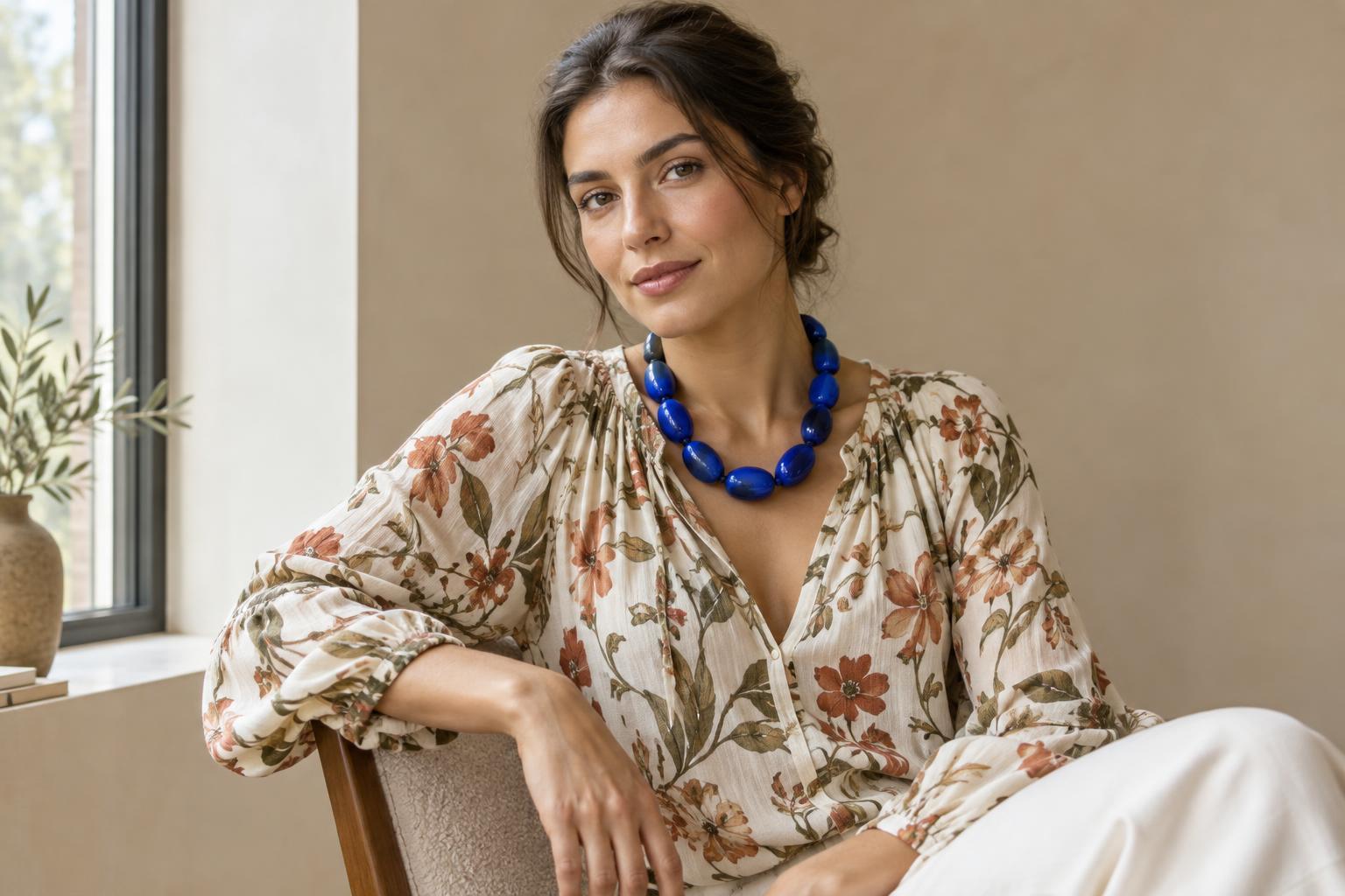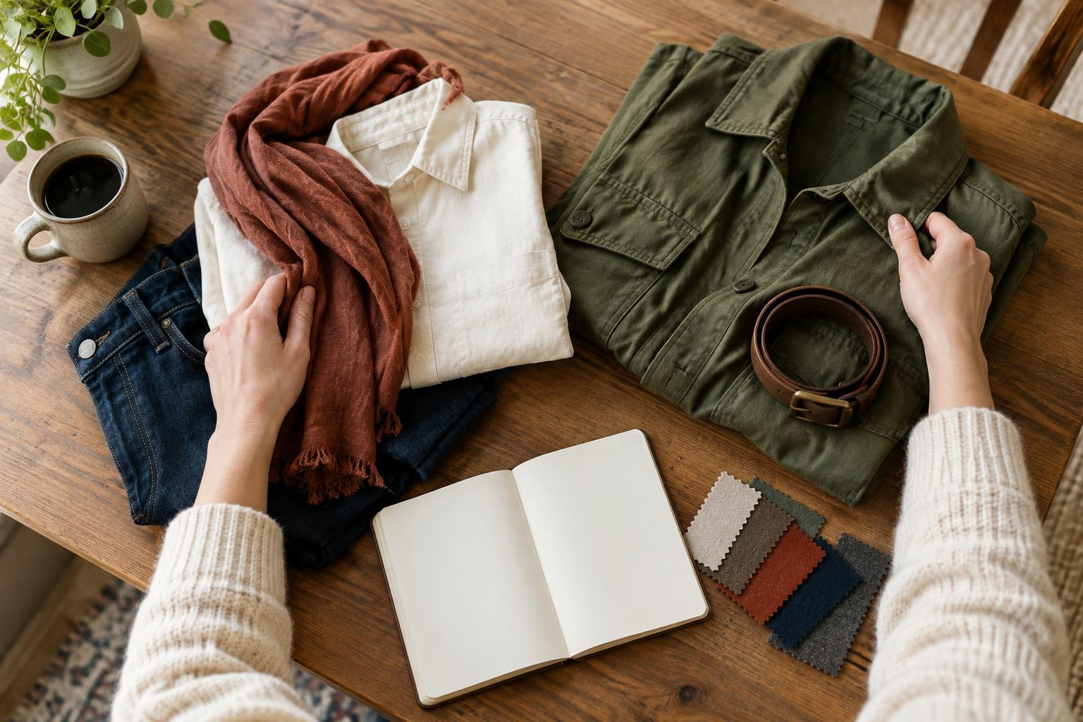
Colour is a conversation between fabric and light
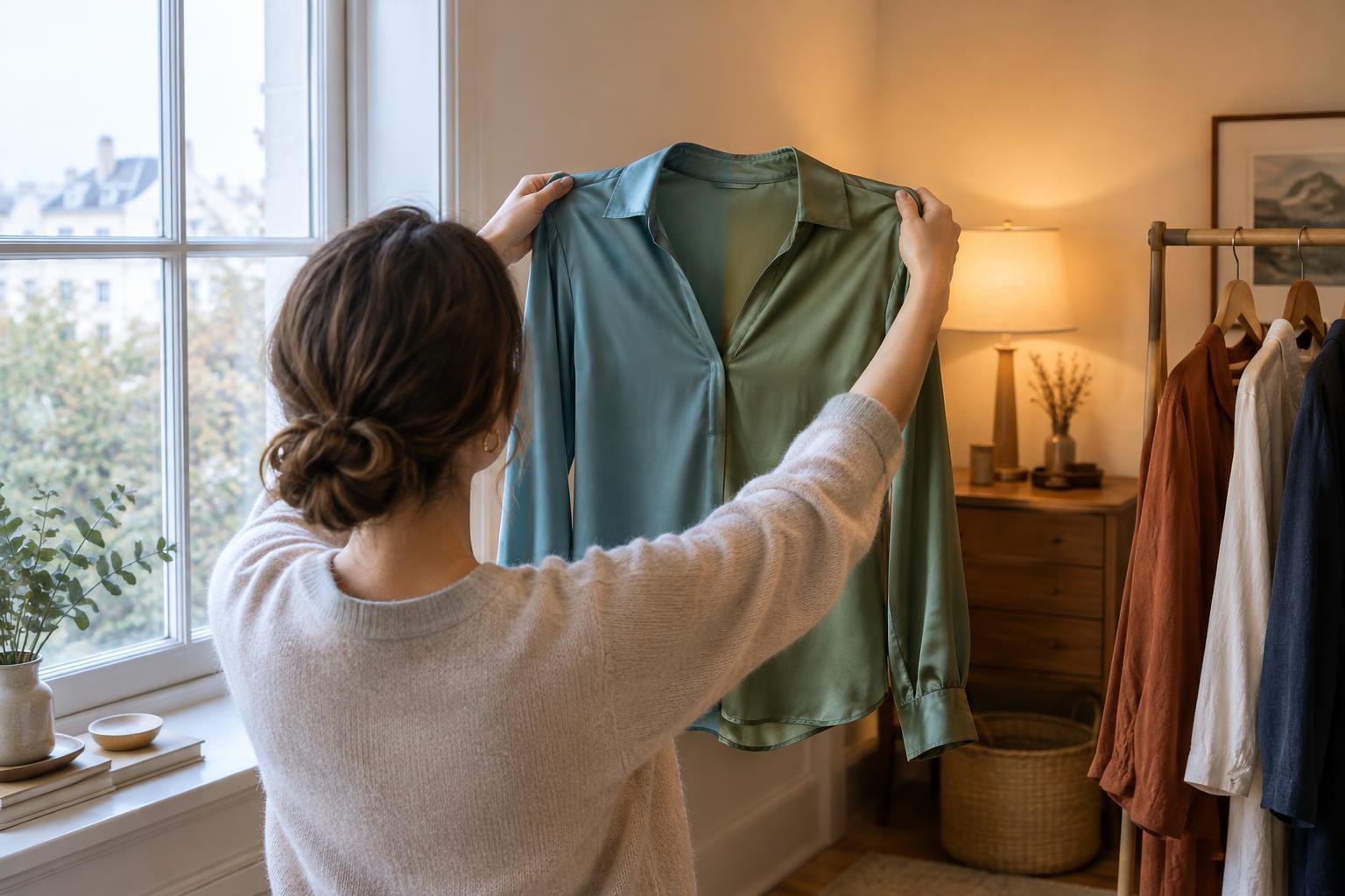
A shirt does not carry a single, unchanging appearance from place to place. Its colour is what you perceive when light falls on the fabric, some of that light is absorbed, and the rest reaches your eyes. Change the light, and you may change what the fabric can reflect. That is why a blue-green top might read as crisp blue beside a window but look greener under a lamp.
Daylight and indoor lighting can differ in both their overall cast and the mix of colours they contain. Some indoor lights make whites appear warm and creamy; others make them look cool or slightly grey. Your eyes also adjust to the setting, so a shift may be easy to miss until you compare two garments side by side. None of this means your first impression was wrong. You saw the clothing under a different set of conditions.
Why two colours can match in one room and clash in another
Imagine pairing a burgundy scarf with a patterned jacket. Under one light, the scarf may seem to echo a red detail in the pattern. Under another, the scarf may look more purple while the jacket detail stays warm red. Materials and dyes can respond differently to changes in light, even when they appear closely matched at first. This is especially noticeable when you are trying to repeat an exact shade across separate pieces.
Texture adds another variable. Smooth satin catches bright highlights, while a fuzzy knit scatters light across its surface. A dark velvet can appear rich where it faces the light and almost black in its folds. Prints may also lose definition in dim lighting: small contrasts that are clear in daylight can merge from a distance. When assembling an outfit, consider not only whether the colours match up close, but whether the details you want people to notice remain visible in the places you expect to wear it.
Use a two-light check before deciding
For a useful comparison, look at an outfit in indirect daylight and under the indoor lighting where you are likely to wear it. Stand back far enough to see the whole silhouette, then move closer to inspect the colours you want to coordinate. If a piece is for an indoor event, that setting may matter more than how it looks outdoors. If you will move between settings, ask whether you still like the combination in both, rather than expecting it to look identical.
When comparing garments, place them next to each other instead of relying on memory. Pay attention to near-matches: two creams, two blacks or two versions of the same accent colour. If a near-match shifts awkwardly, you could separate the pieces with a different colour, choose a stronger contrast, or repeat the colour in a small accessory so the relationship looks intentional. There is no need to reject every changing colour; a fabric that shifts pleasantly can be part of the appeal.
Notice what surrounds the garment
Lighting is not the only influence on what you see. A pale yellow blouse can look different against a white wall than it does under a navy coat. Bright colours nearby may change how you perceive a quieter shade, and a large patterned piece can make a small accessory seem less vivid. When a colour combination feels off, try viewing each item alone, then together. This helps you distinguish a lighting change from an effect created by neighbouring colours.
Mirrors and screens can complicate the comparison. A photograph may look warmer or cooler than the scene in front of you because a camera adjusts its interpretation of the light. Screens then display that image in their own way. Photos are useful for judging an outfit’s overall balance, but they are less reliable as a final test of an exact shade. If you take reference photos, use the same spot and lighting each time so the comparisons are more meaningful.
Turn colour surprises into a style exercise
Choose one garment whose colour has surprised you. Look at it beside a window during the day, then under a lamp you regularly use. Pair it with two possible companions: one close in colour and one deliberately contrasting. Note which pairing stays clear in both settings and which one changes character. You do not need technical colour names; descriptions such as “looks softer indoors” or “the pattern stands out more by the window” are enough.
Over time, this small exercise can help you build a practical picture of your wardrobe. You may discover that a favourite accessory brings out different parts of a print depending on the light, or that a bold contrast works more reliably than a precise match. The goal is not to control every colour shift. It is to recognise when light changes the story your outfit tells—and decide which version feels most like you.